|
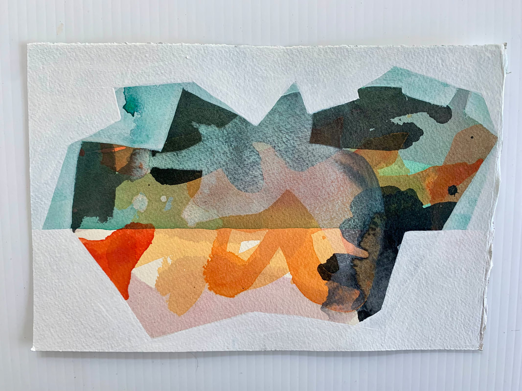
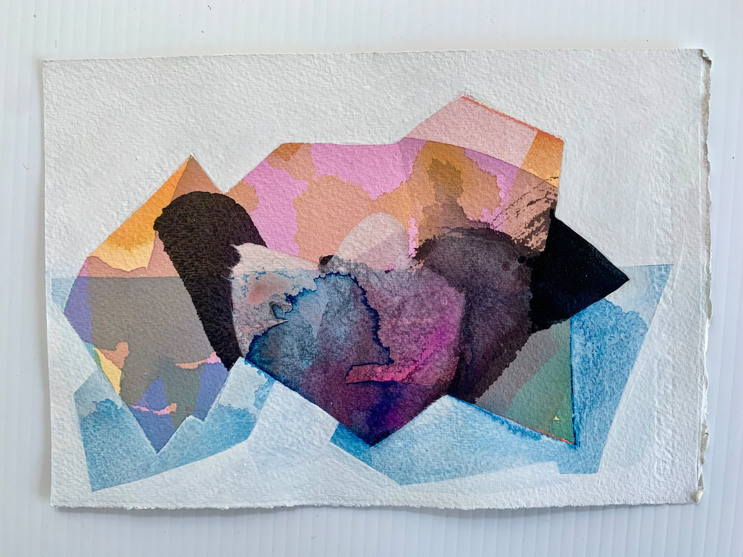
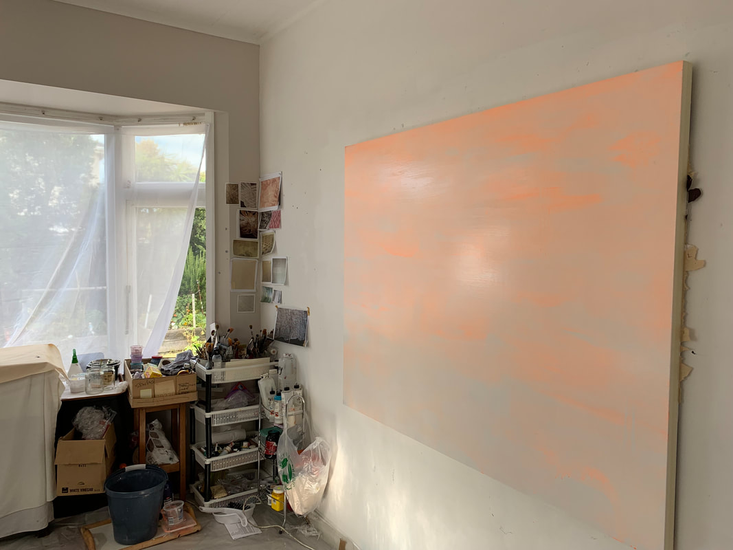
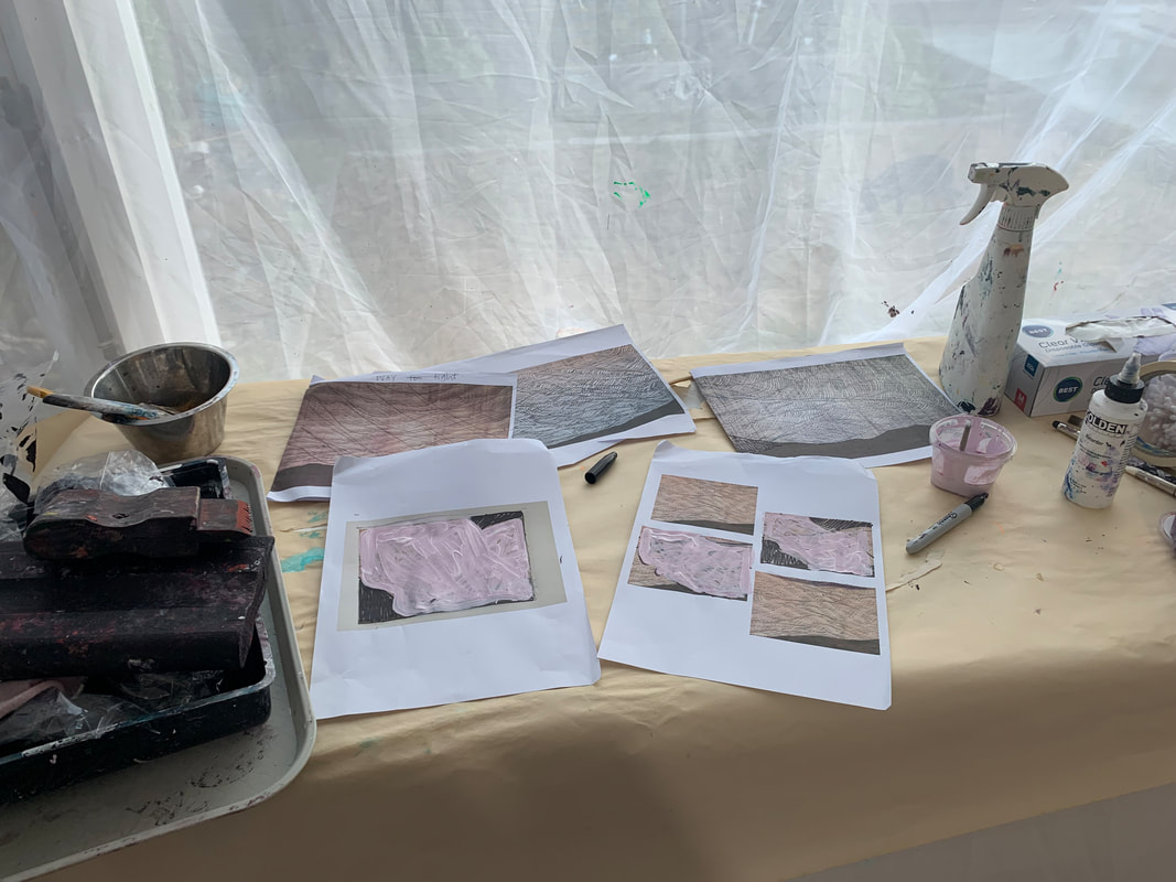
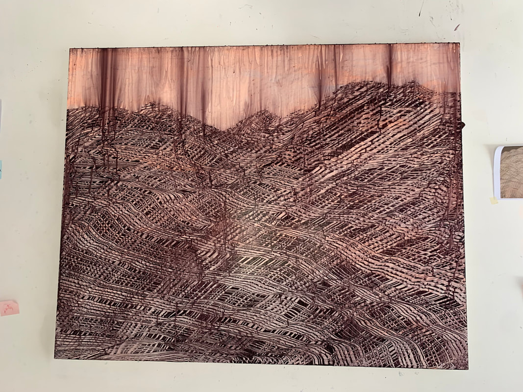
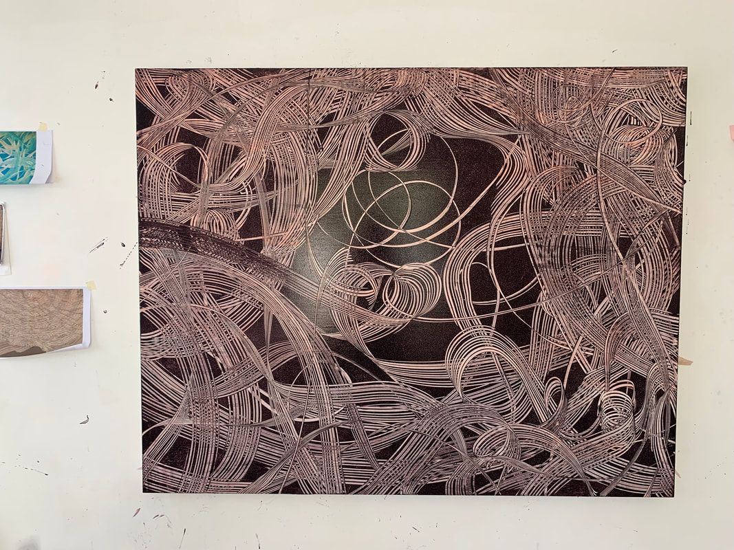
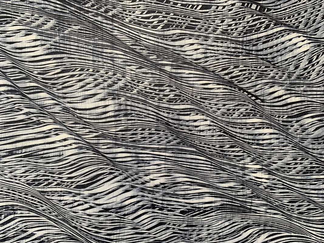
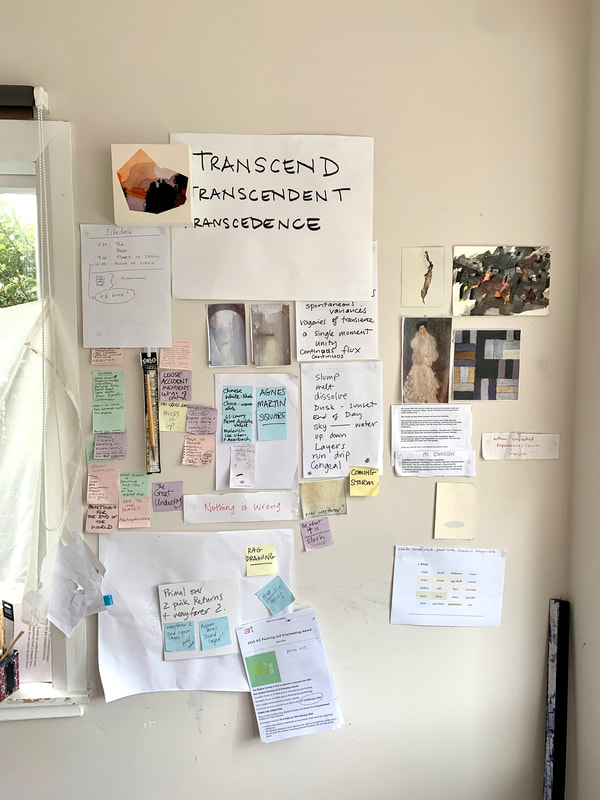
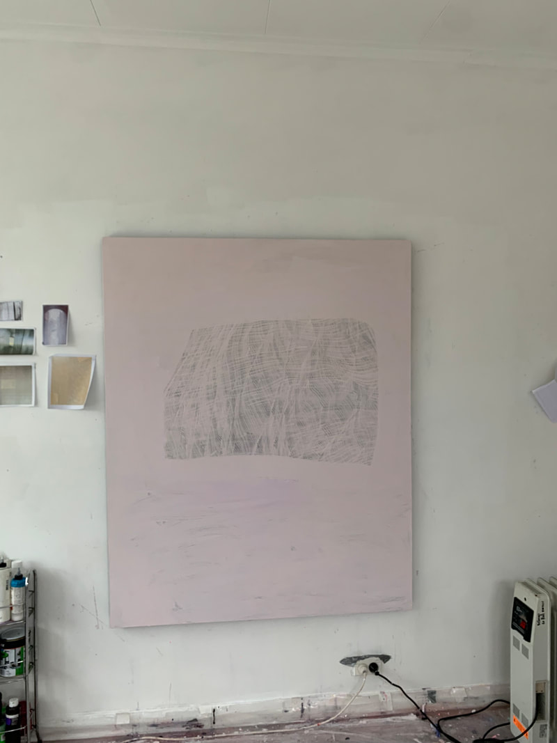
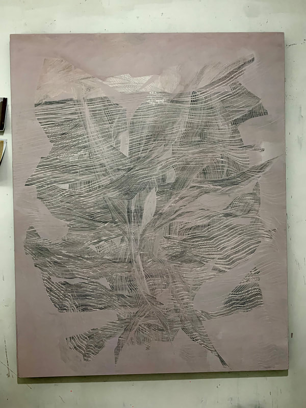
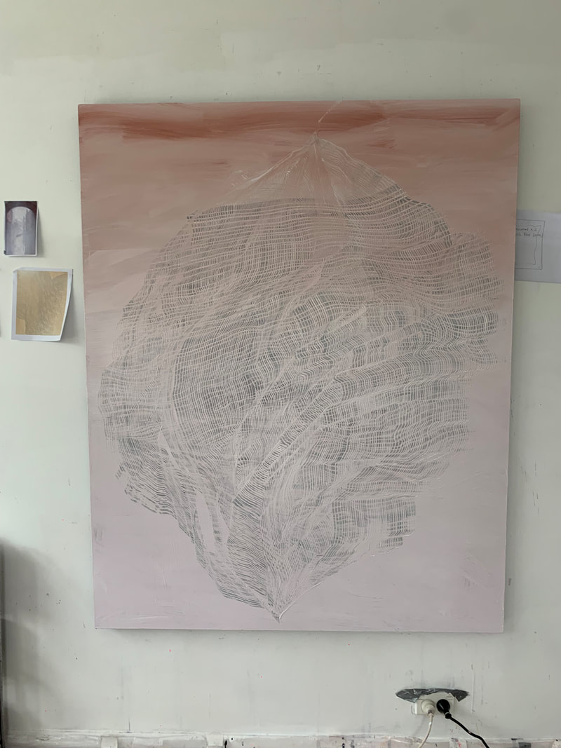
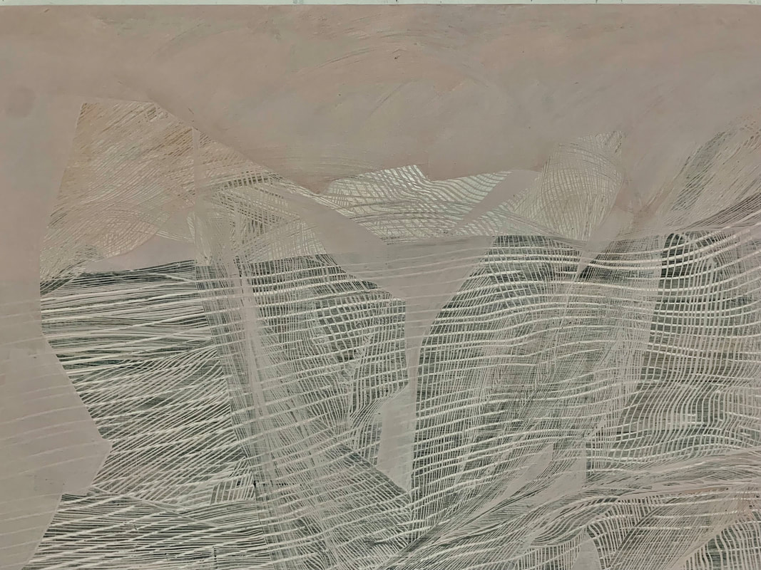
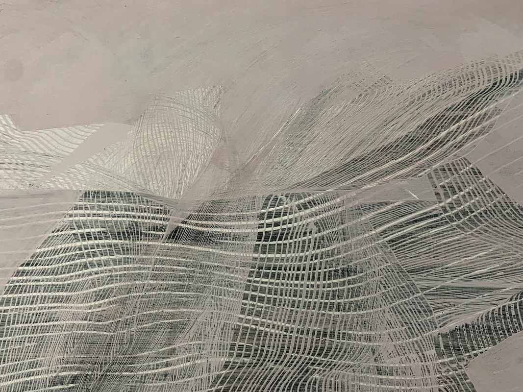
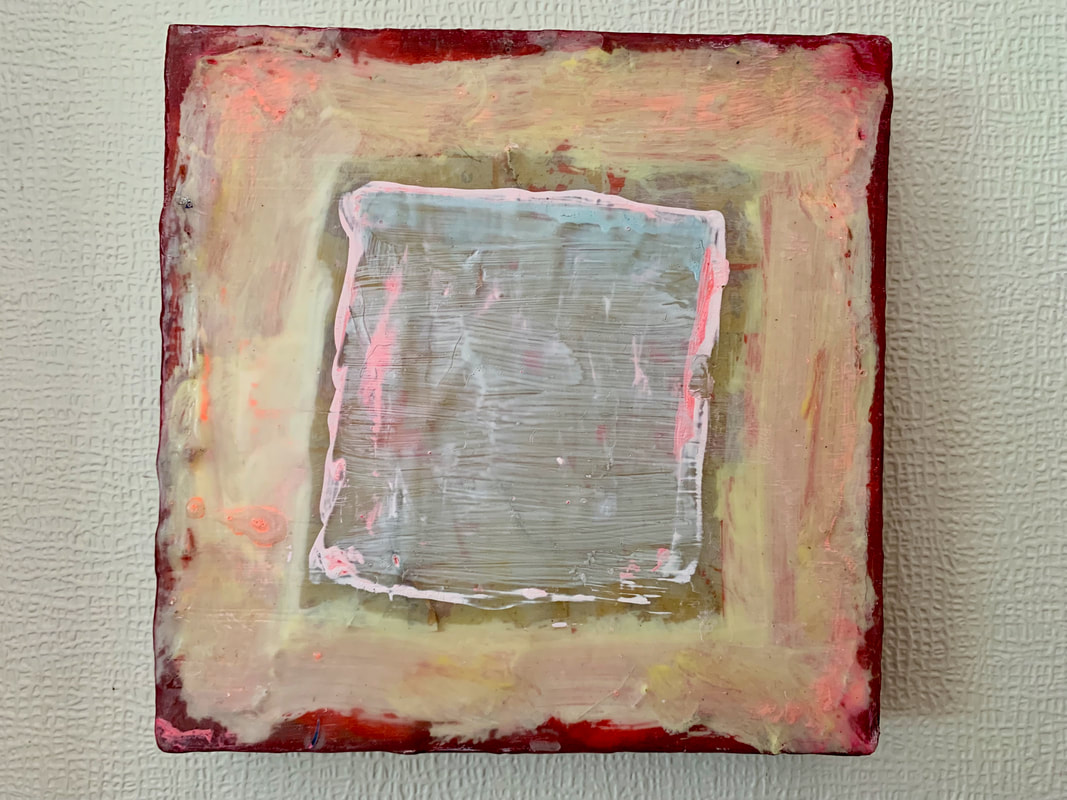
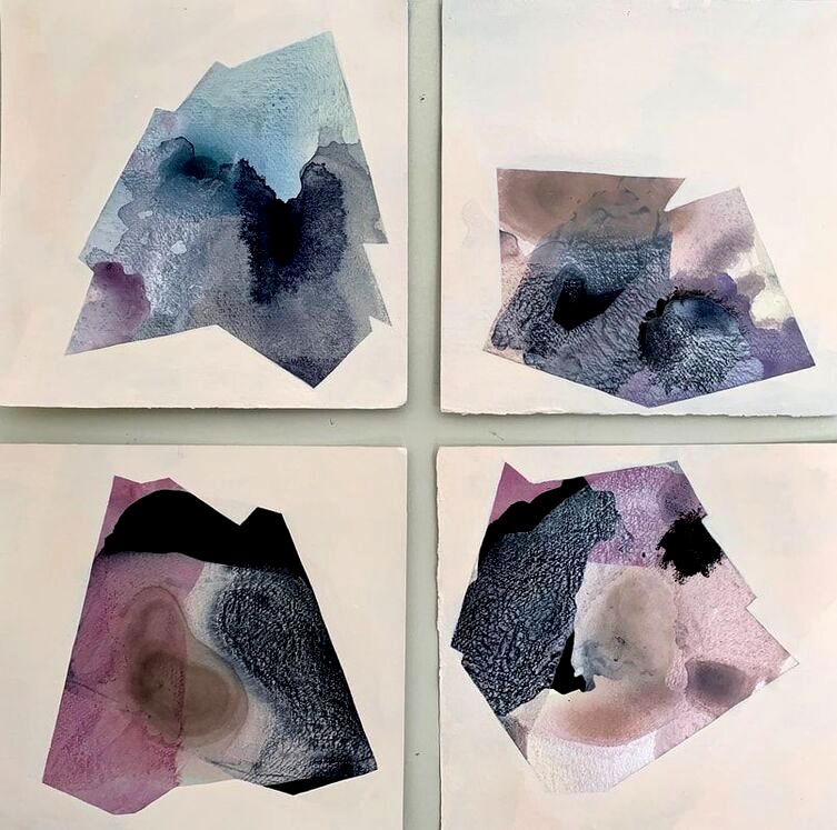
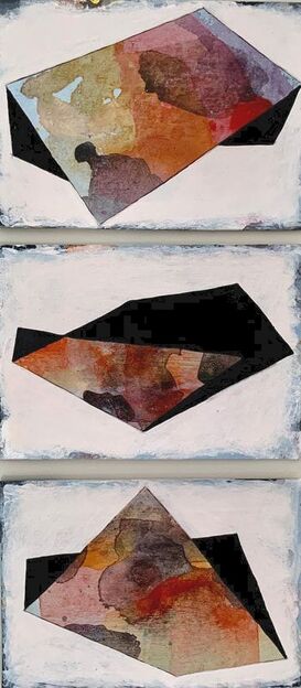
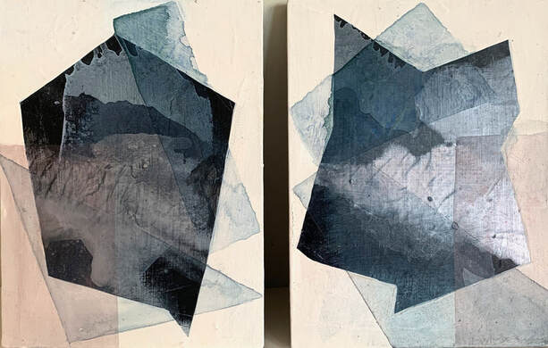
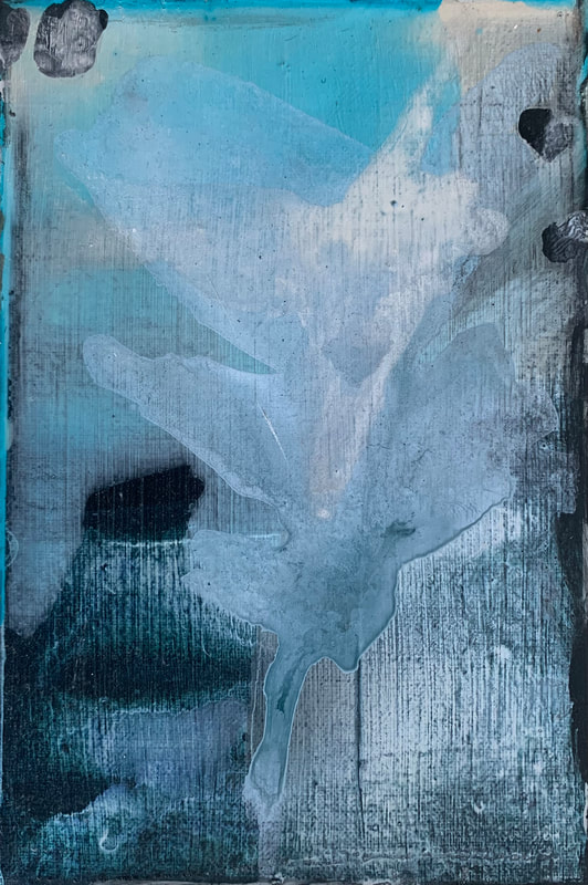
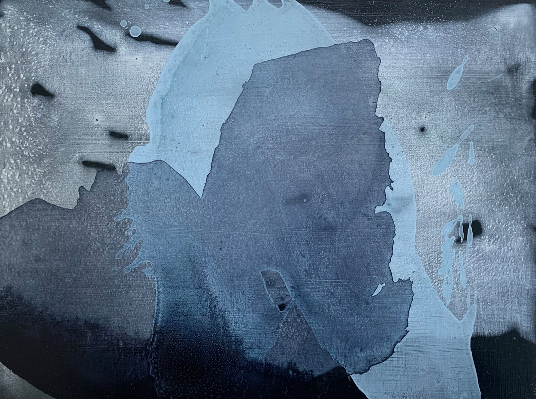
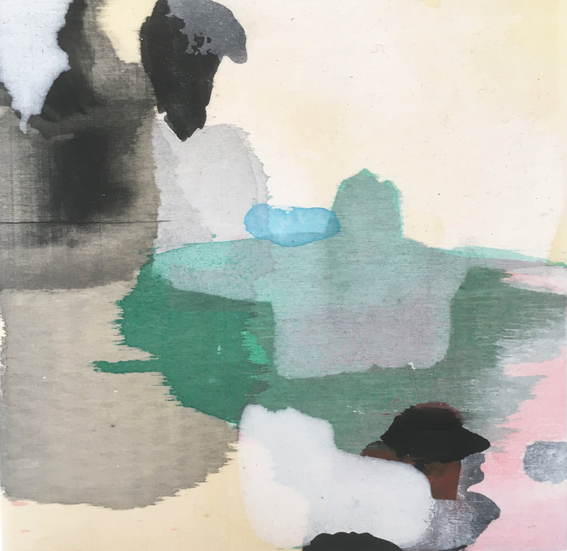
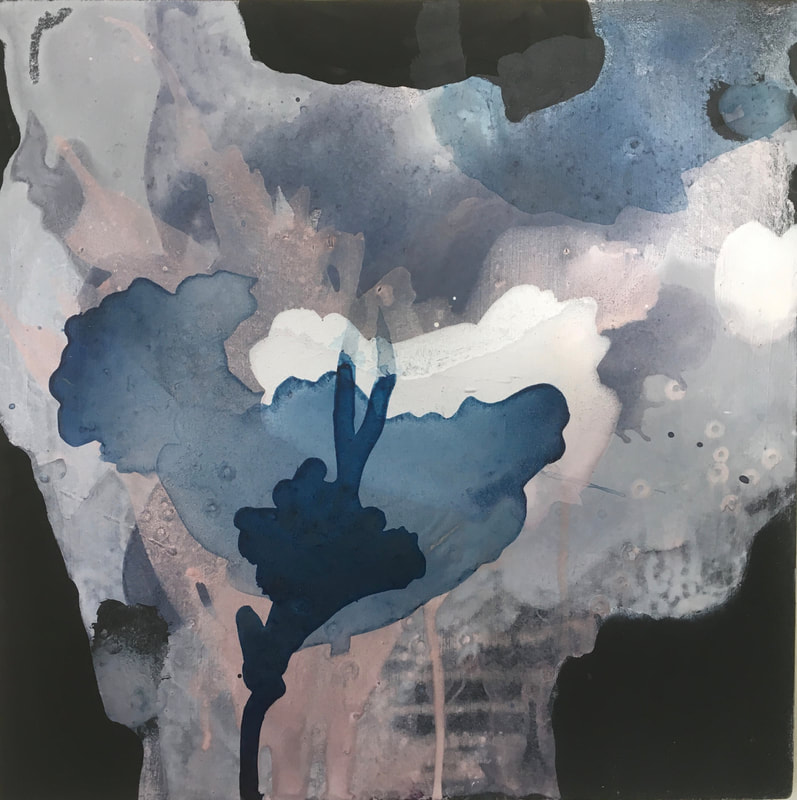
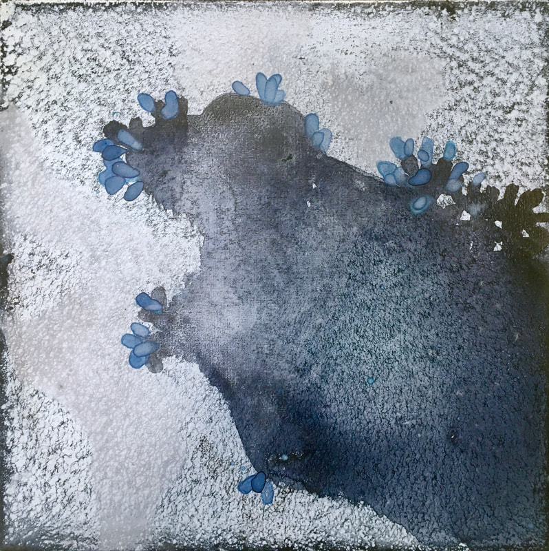
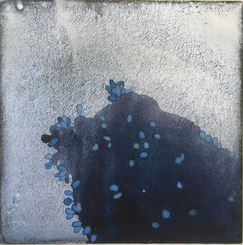
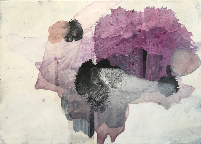
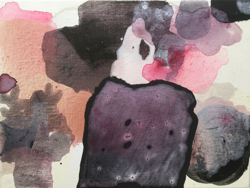
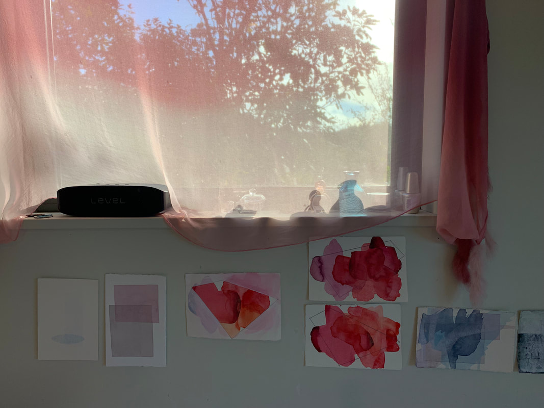
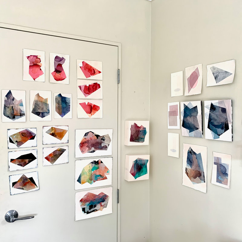
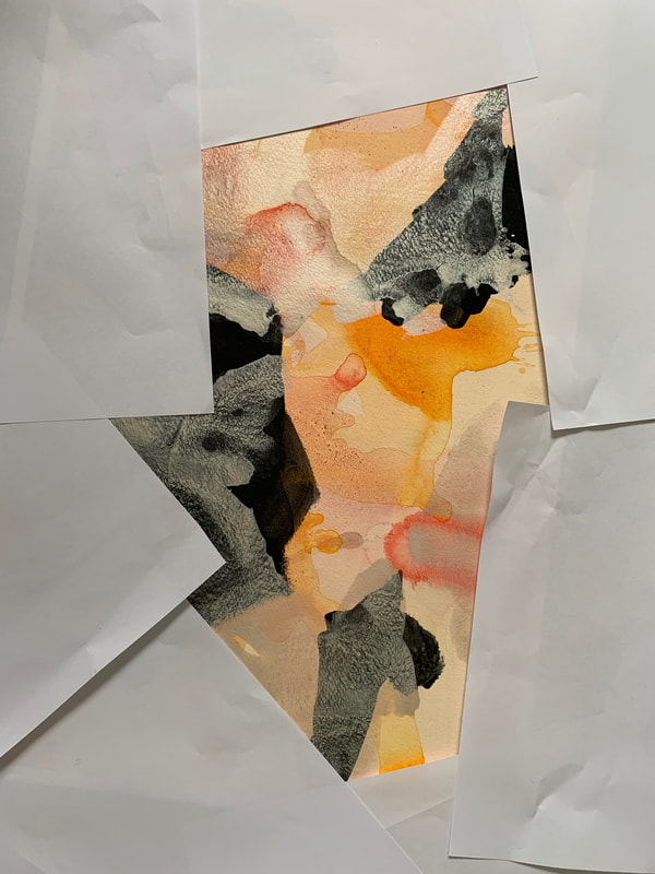
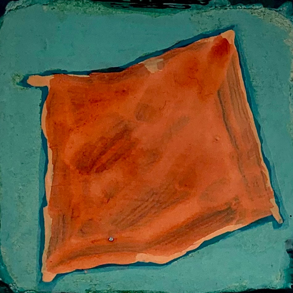
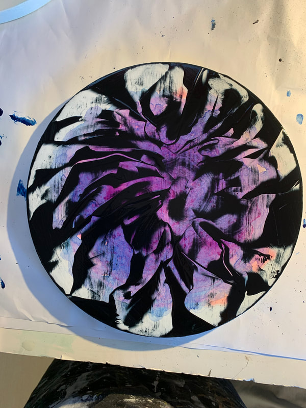
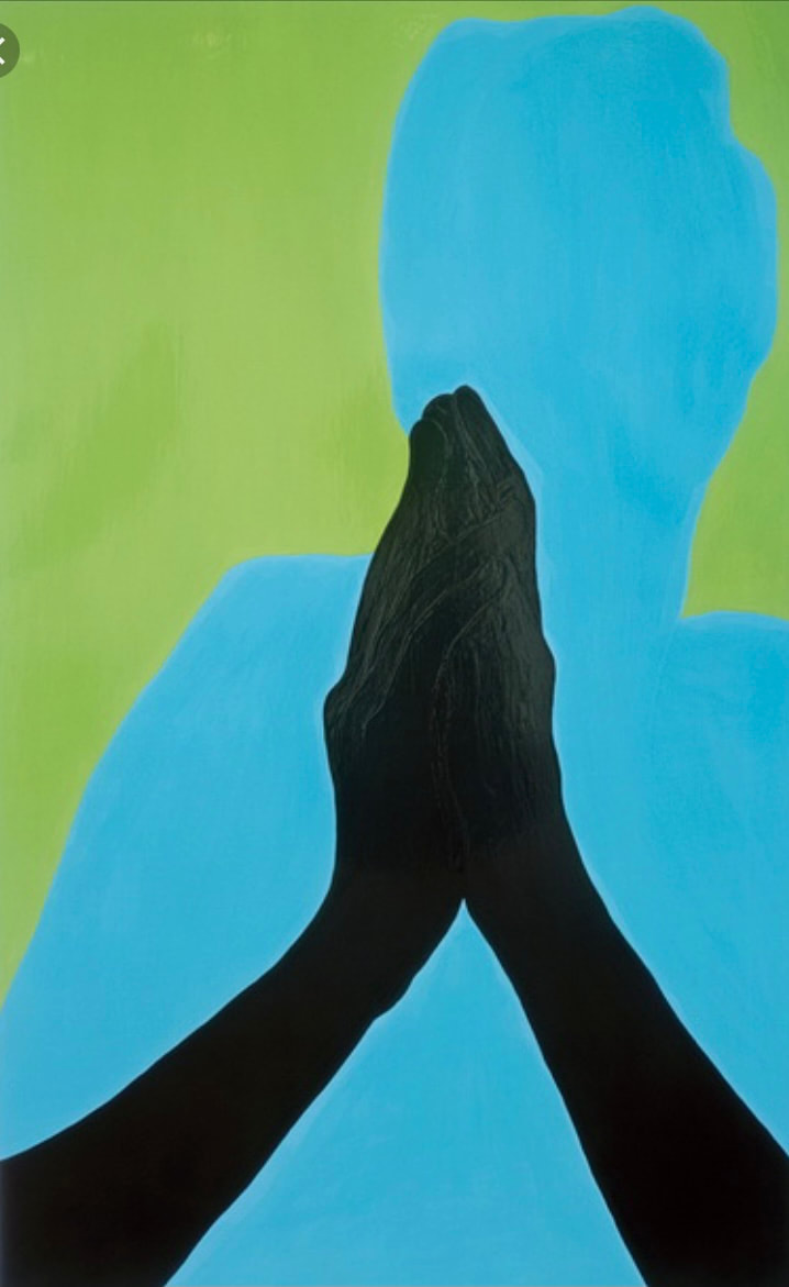
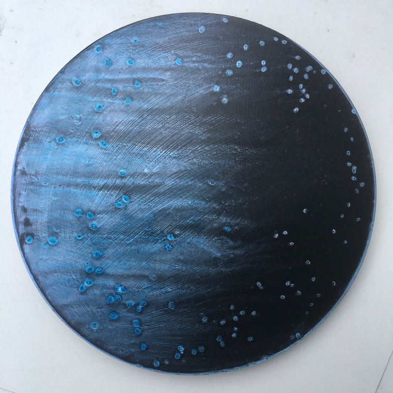
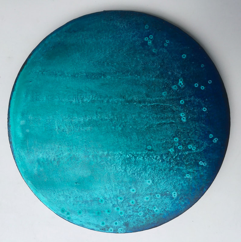
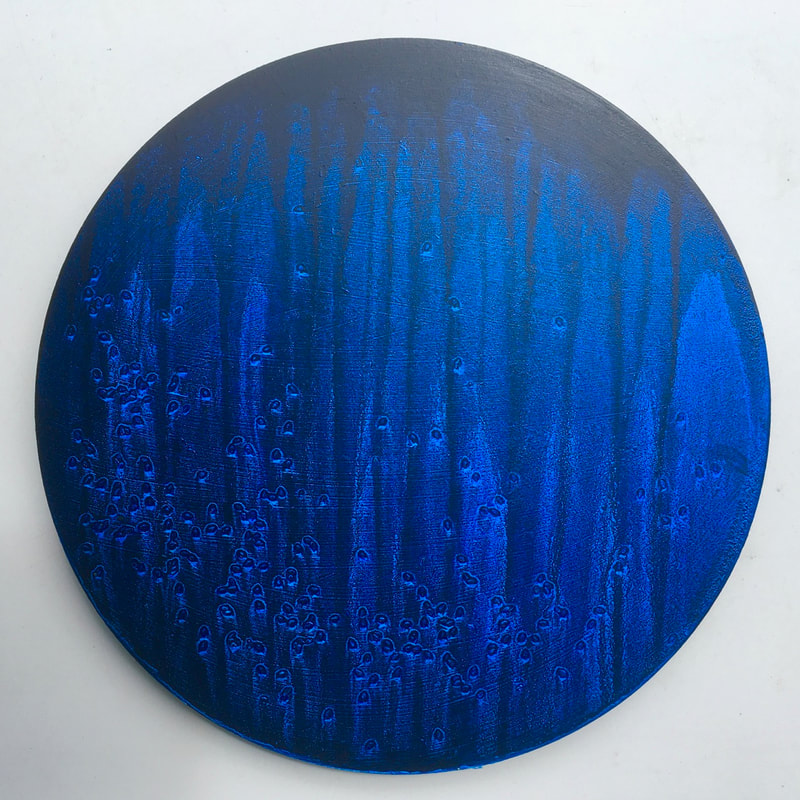
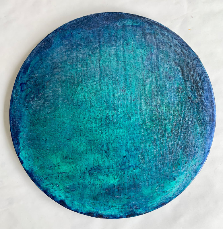
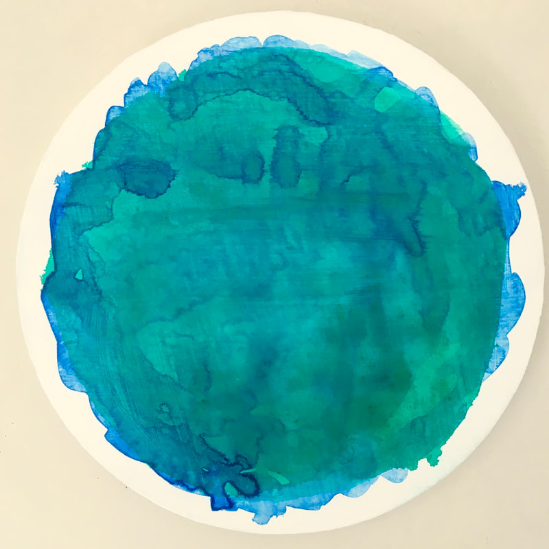
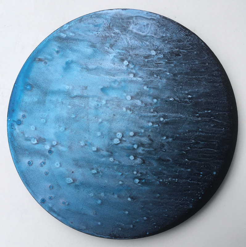
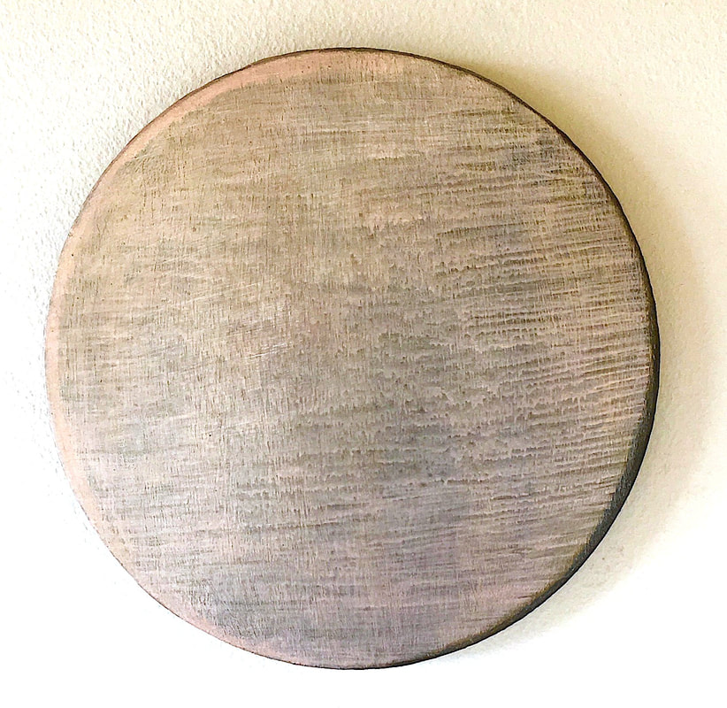
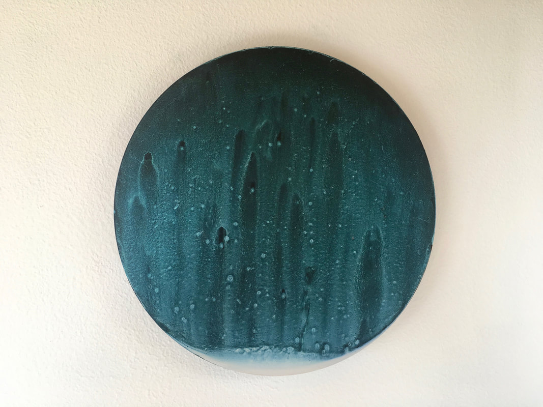
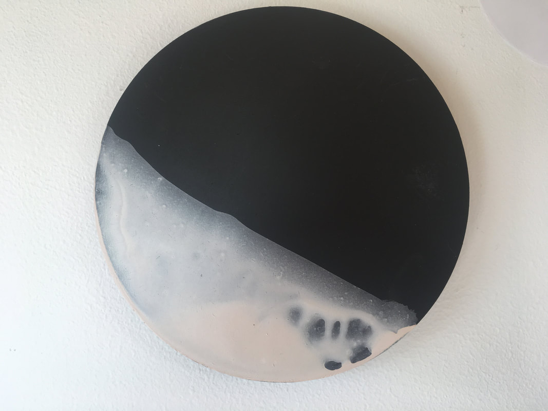
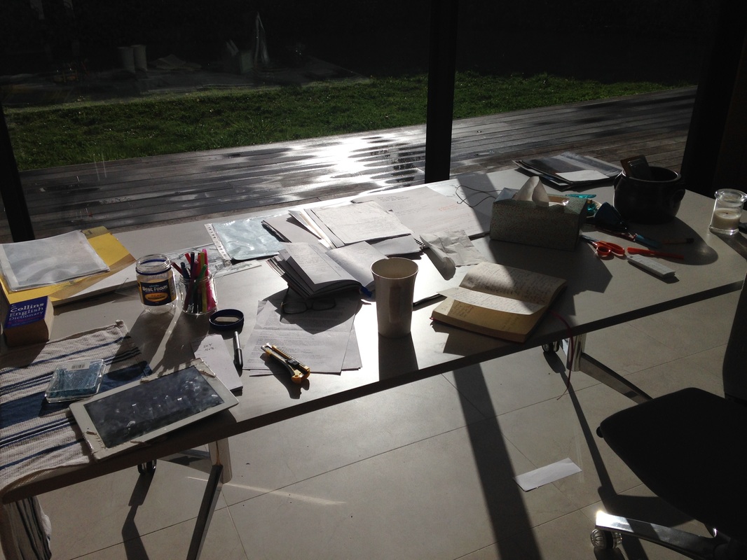
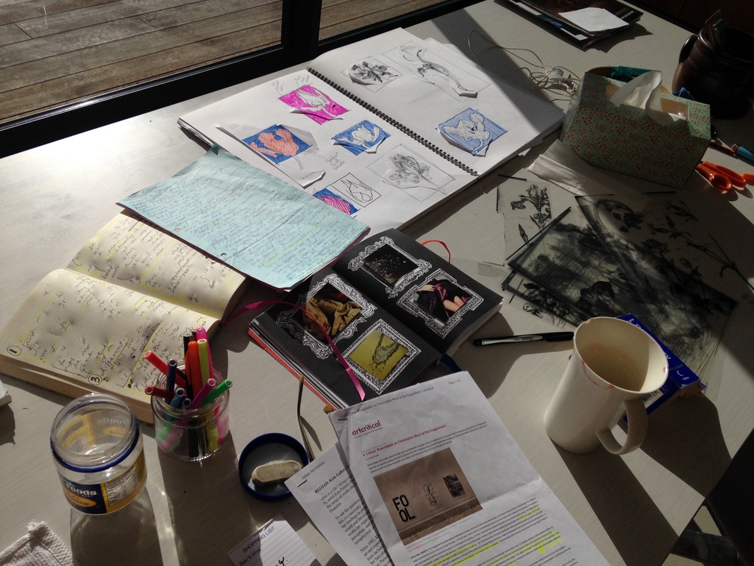
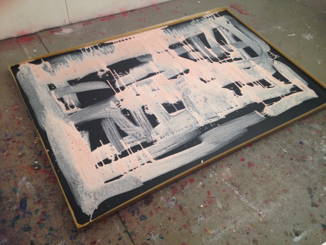
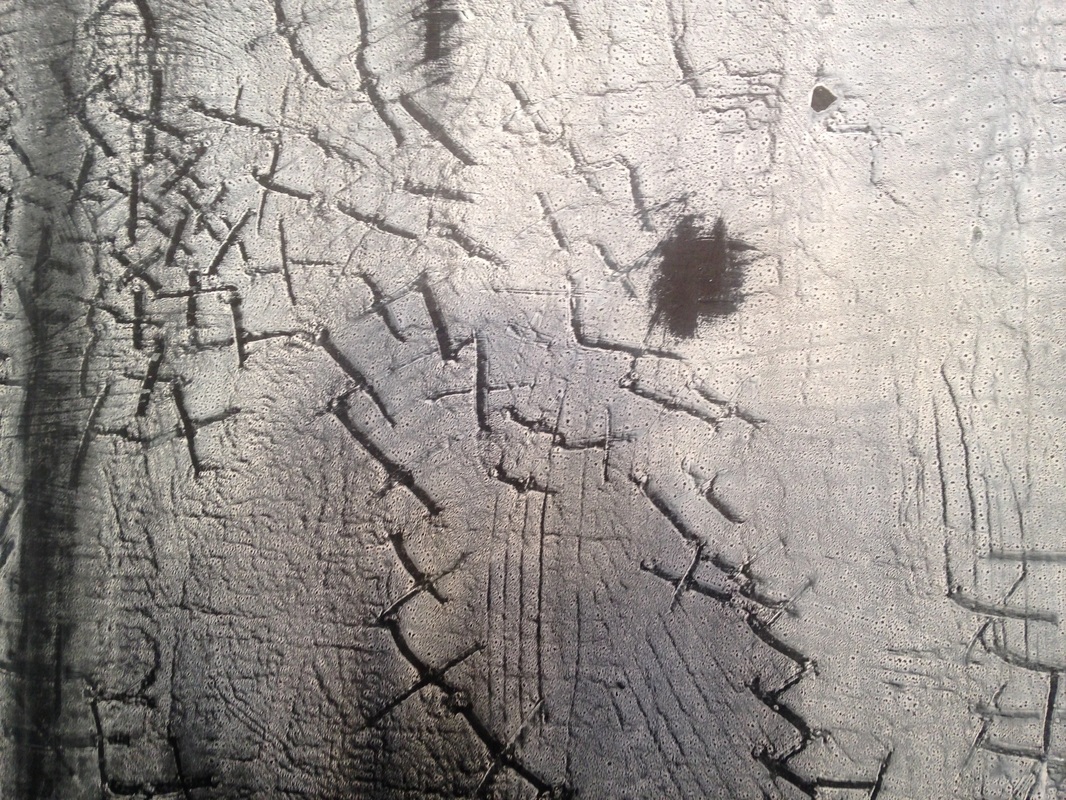
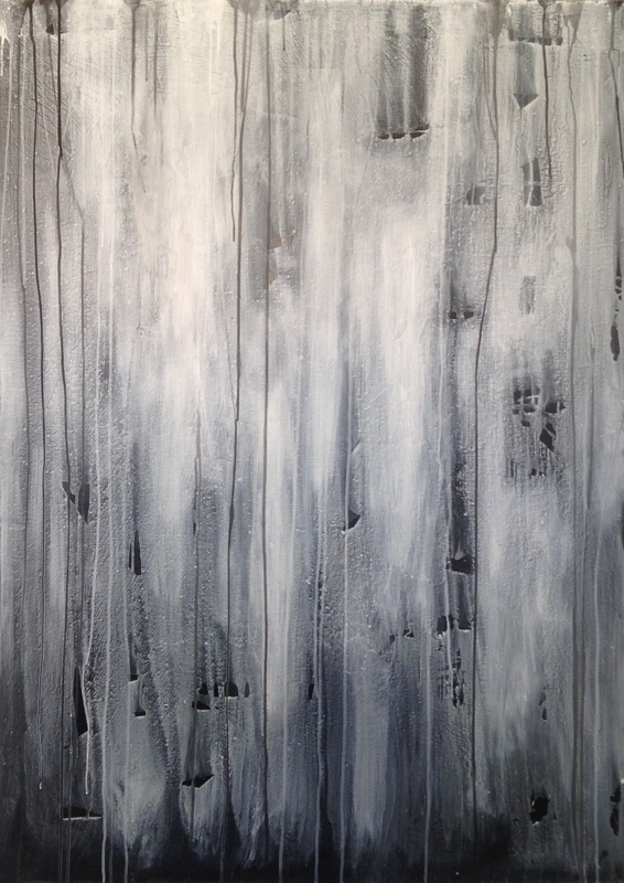
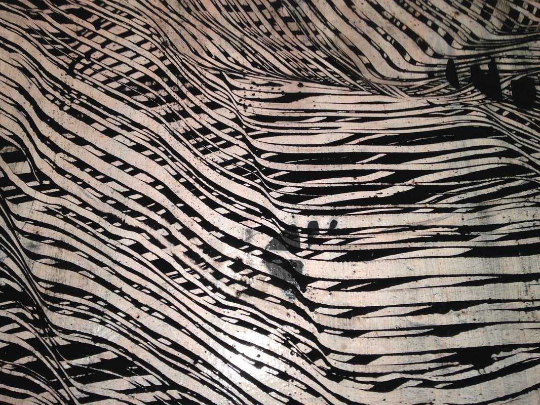
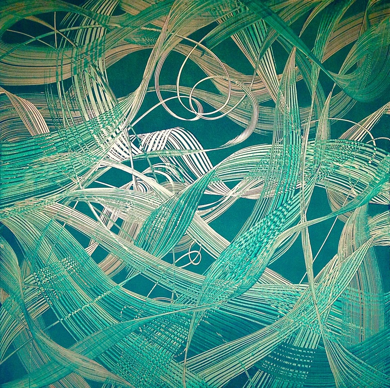
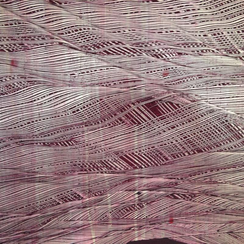
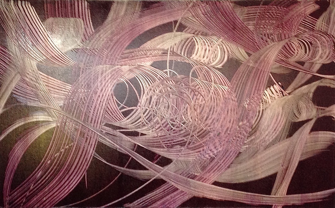
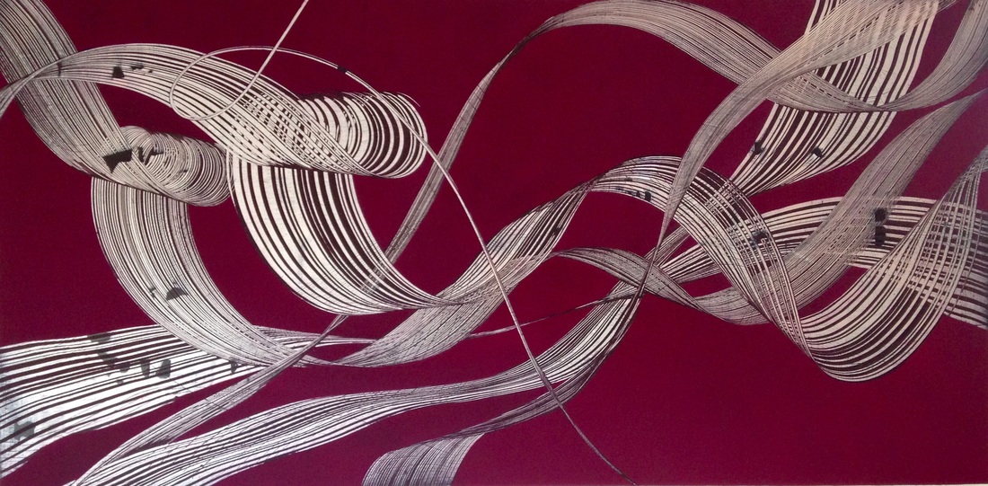
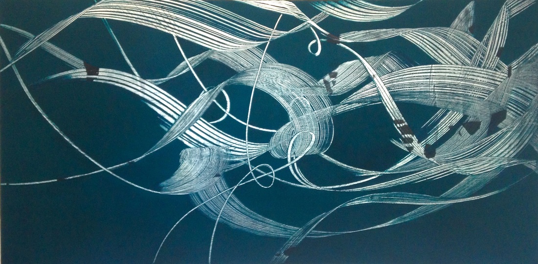
Some of this work was begun 2 years ago, and when I picked it up again and looked at it I could see it was calling out to me (LOL) to add more complexity. Again I am in such ambiguous turf - mountains, seas, icebergs, vessels, boats, rising and falling horizons. I am thinking 'hard-edge abstraction' and also how dire is climate changing, islands to disappear, icebergs melting. Ambiguity first appeared as a theme in my work at art school. in the lates early 90's. The 'combing' series of my last 20 years is all about the ambiguity of figure and ground. It's like I want my work to be super cagey, so it can't be pinned down, boxed, categorised, treading between abstraction and figuration. The work below is small - A5 - so different for me to sit, look down onto a table top, instead of standing, swinging my arms around and pressing hard against walls. 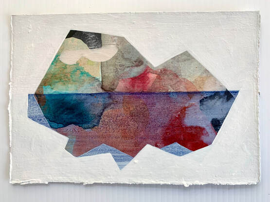 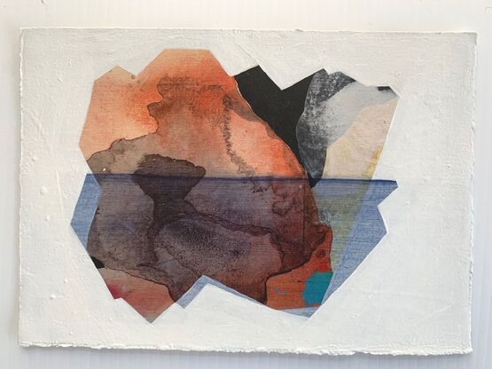 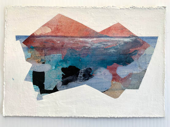 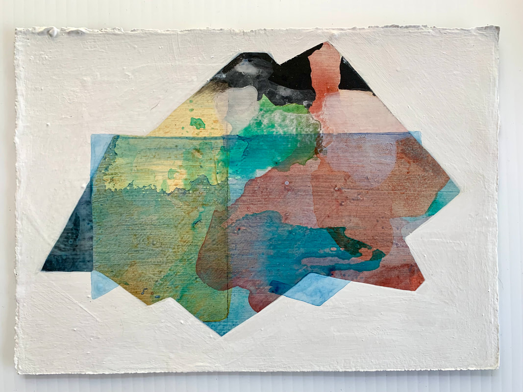 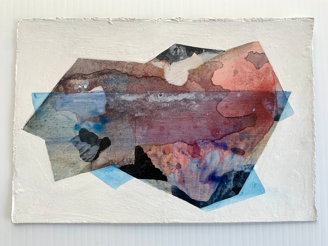 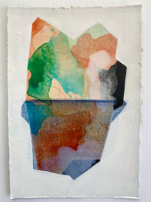 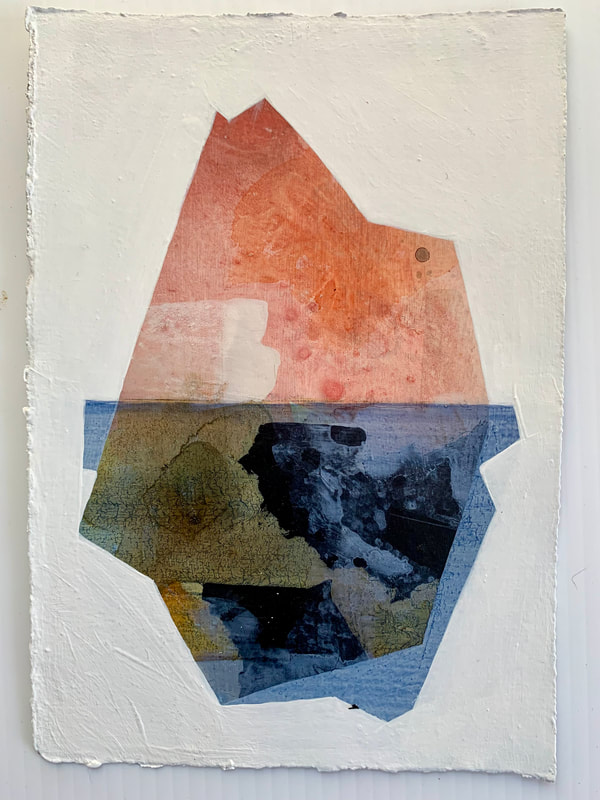 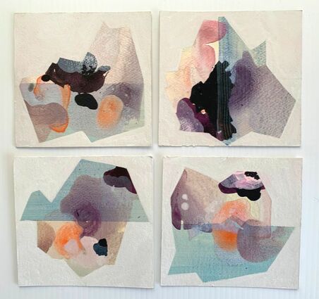 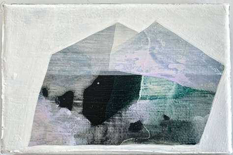
0 Comments
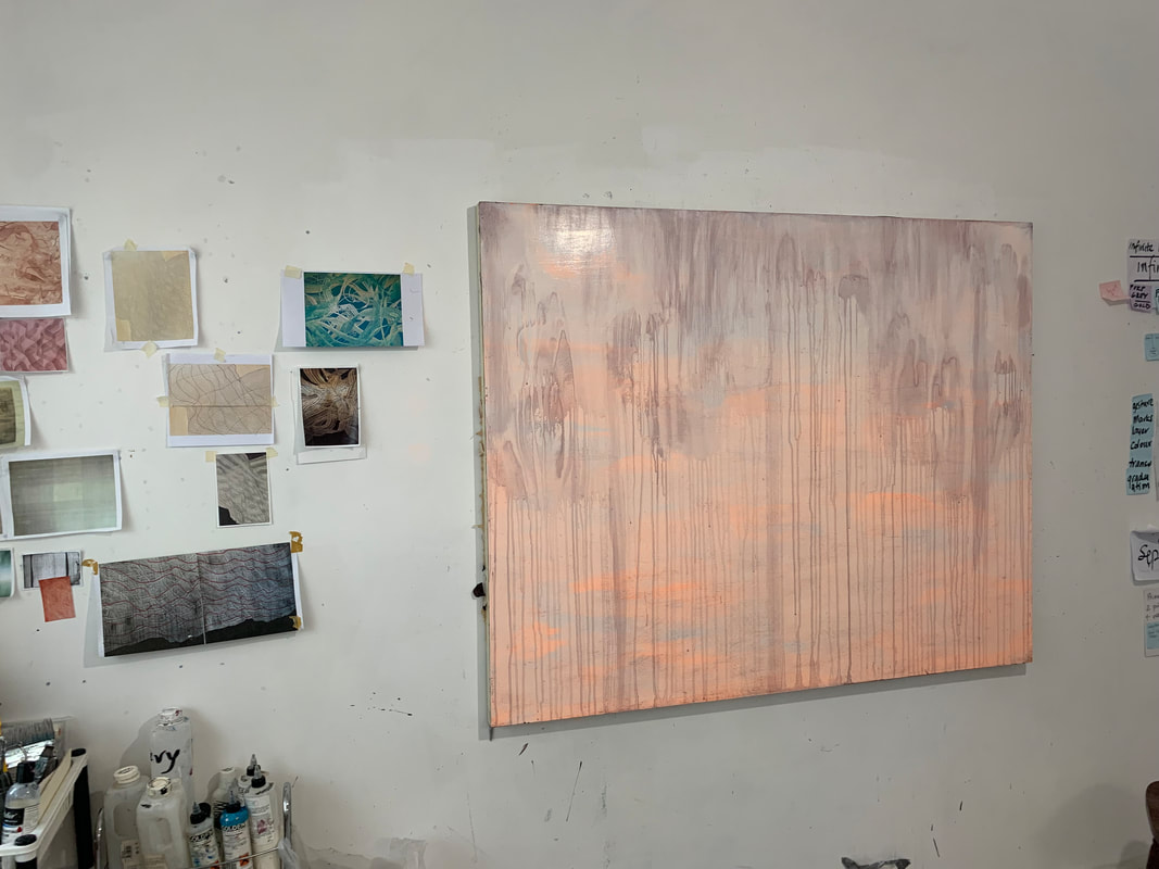
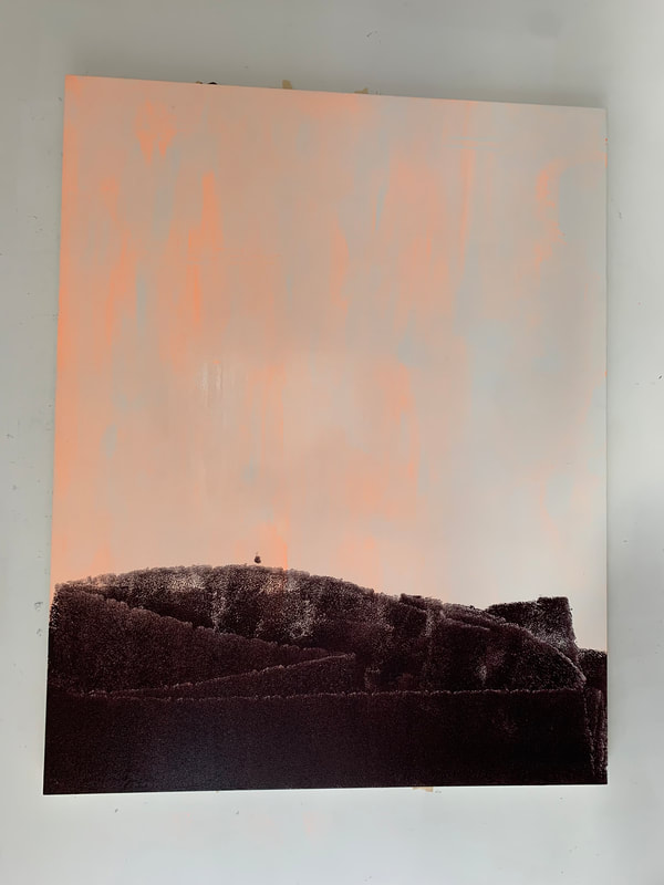
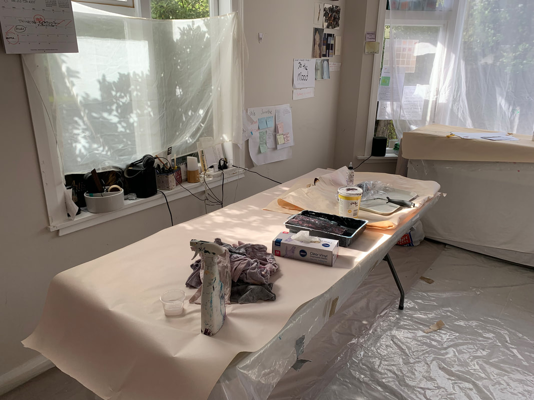
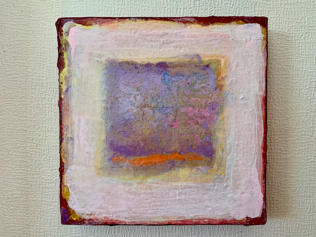
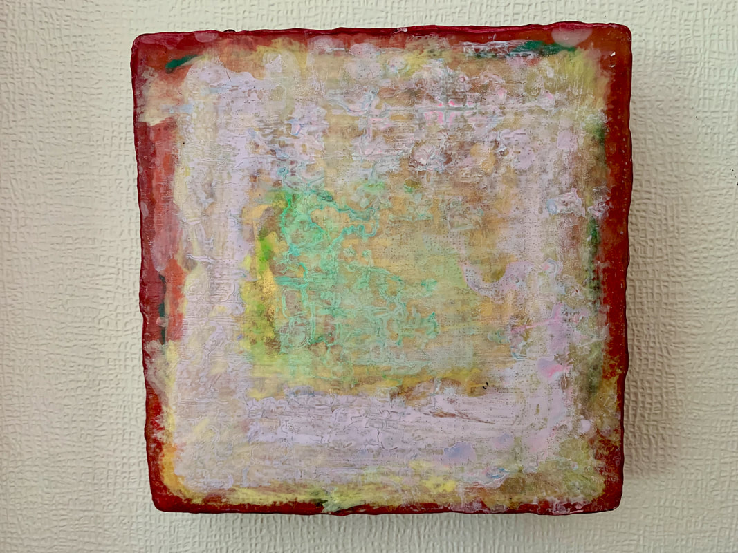
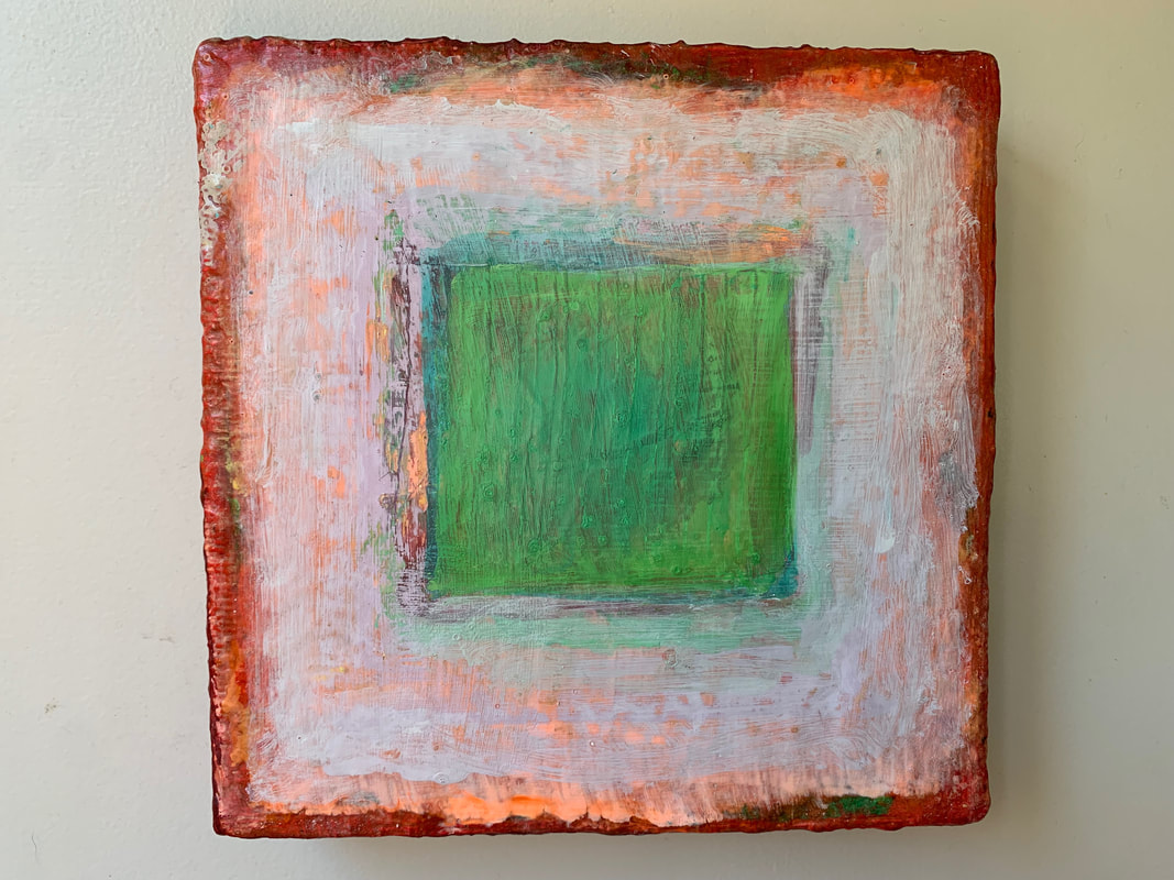
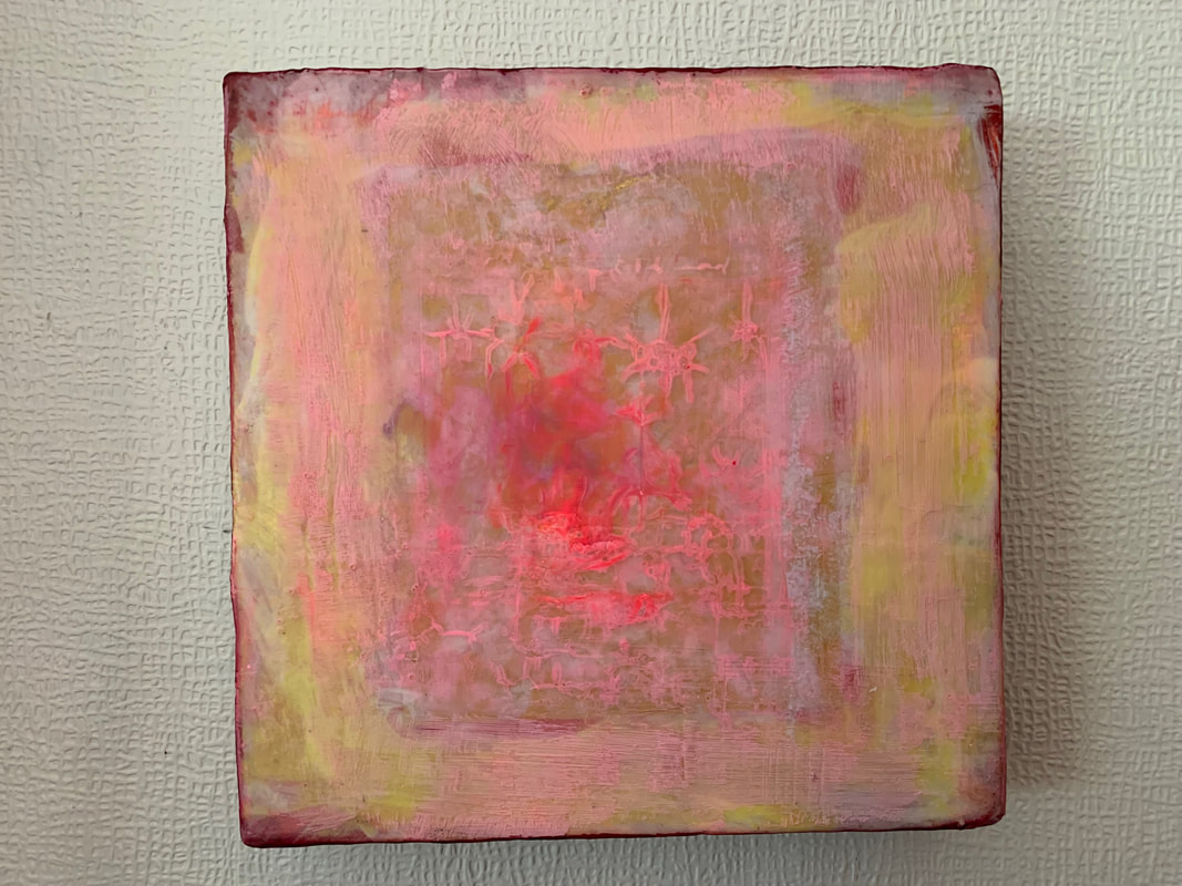
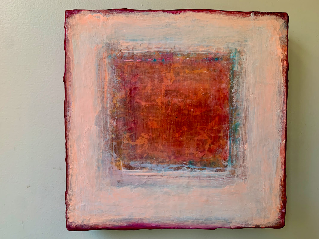
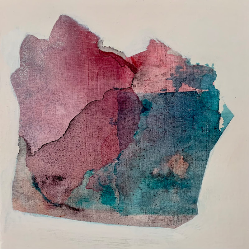
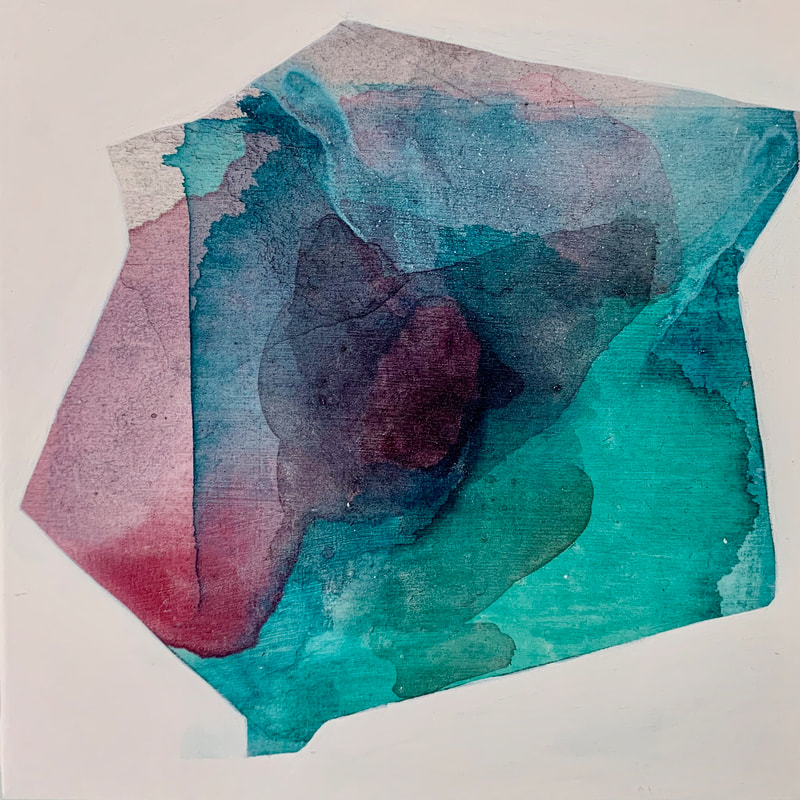
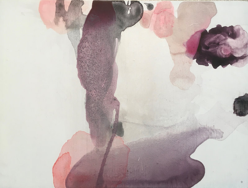
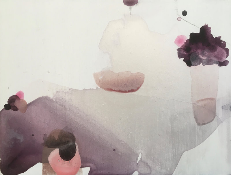
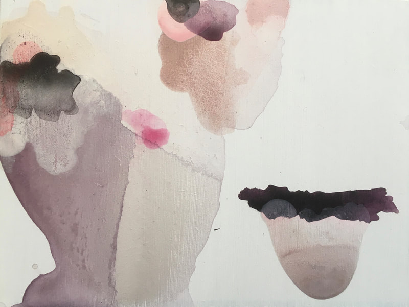
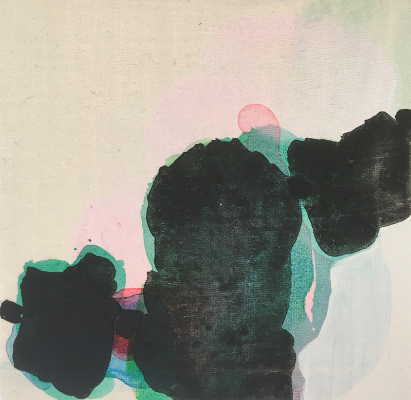
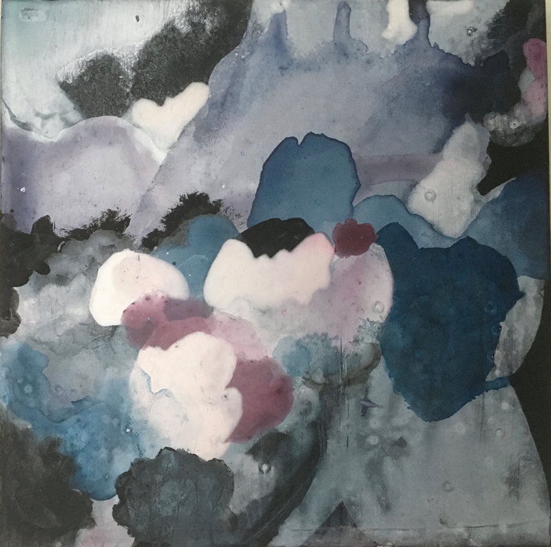
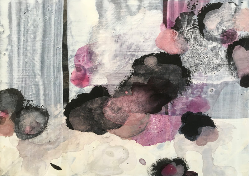
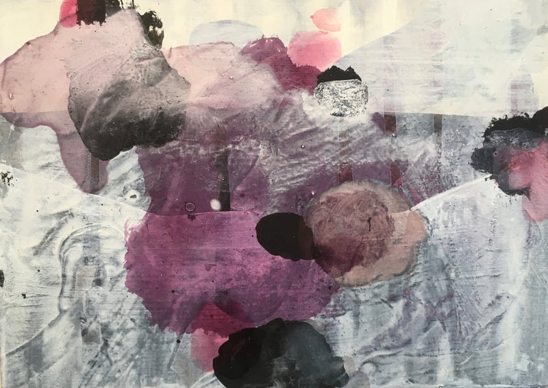
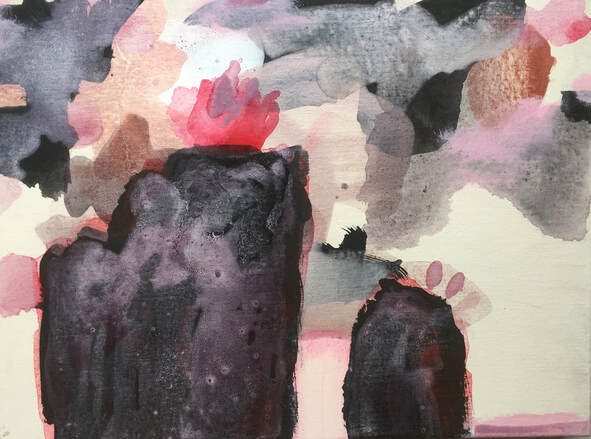
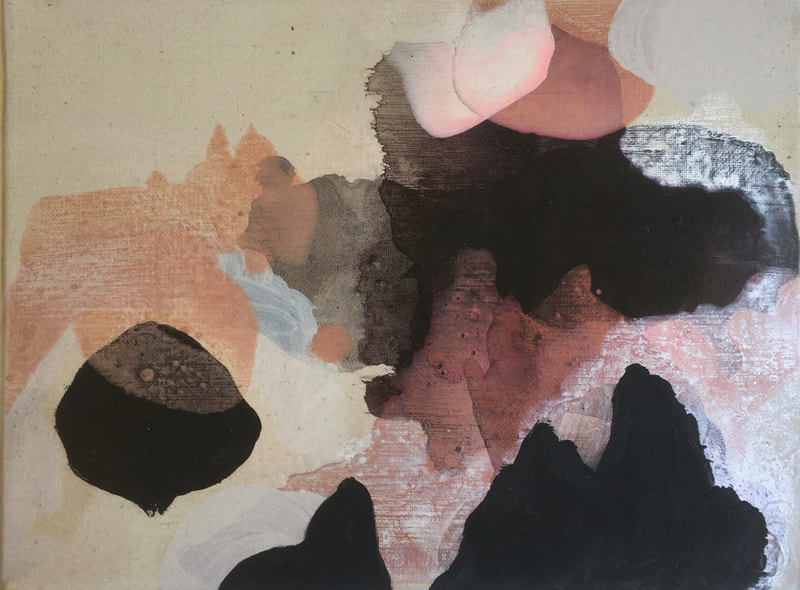
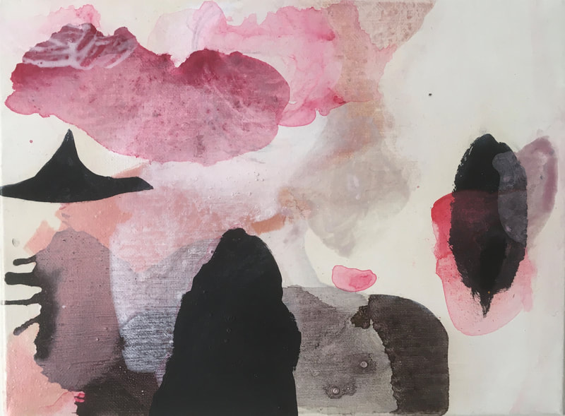
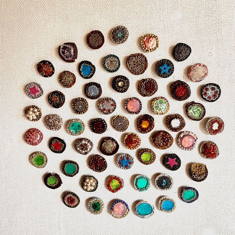
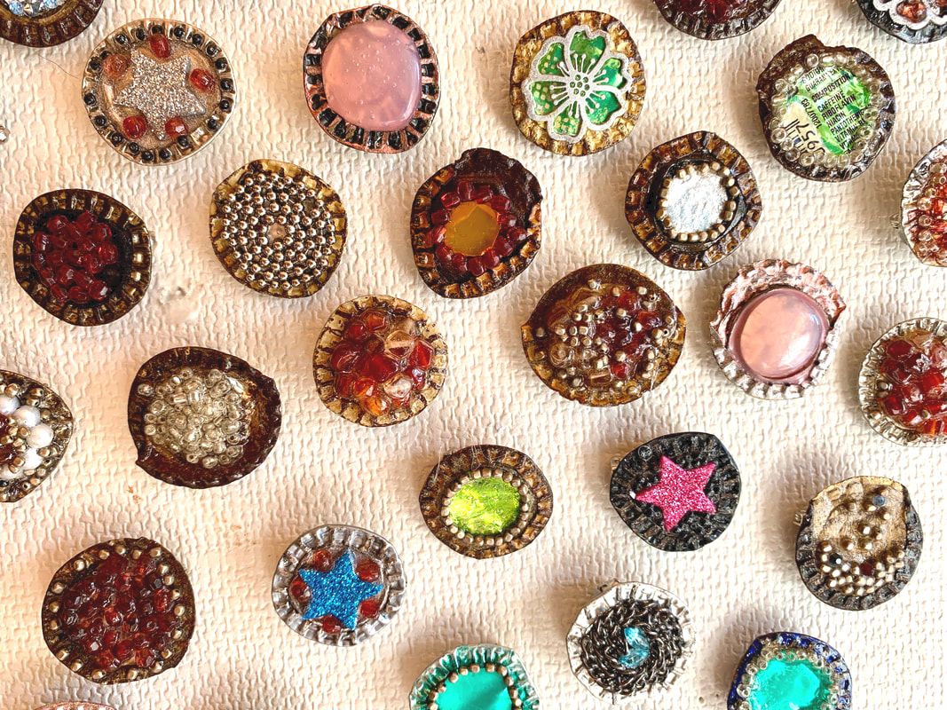
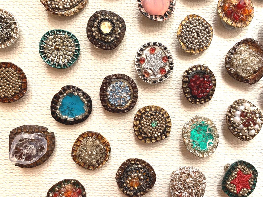
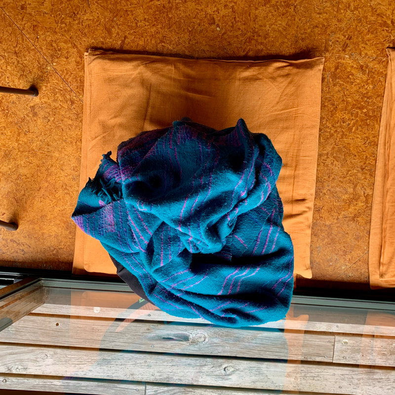
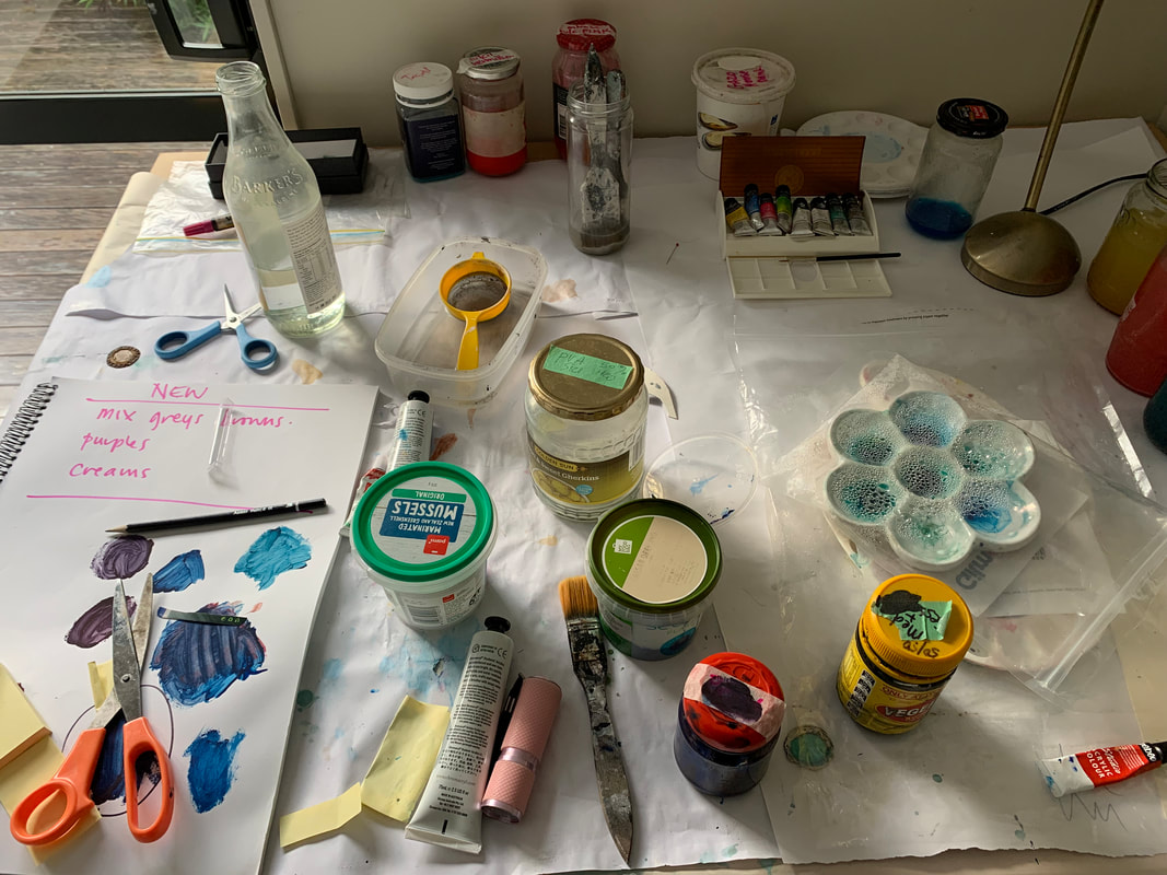
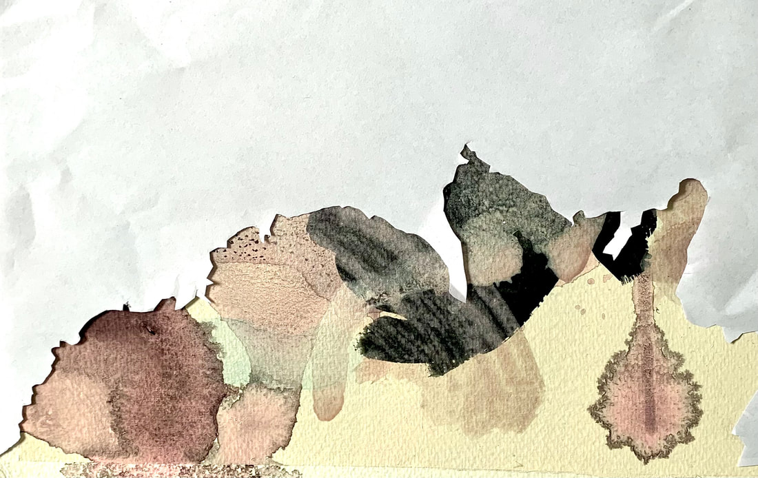
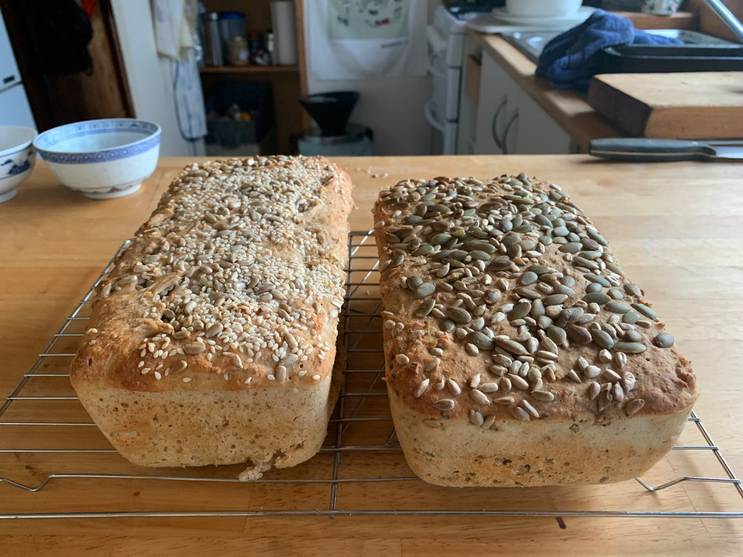
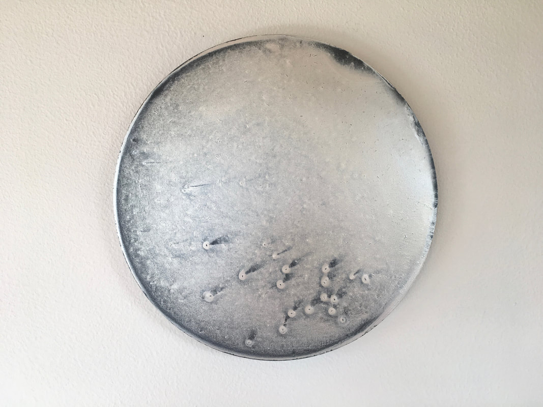
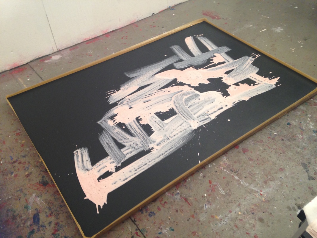
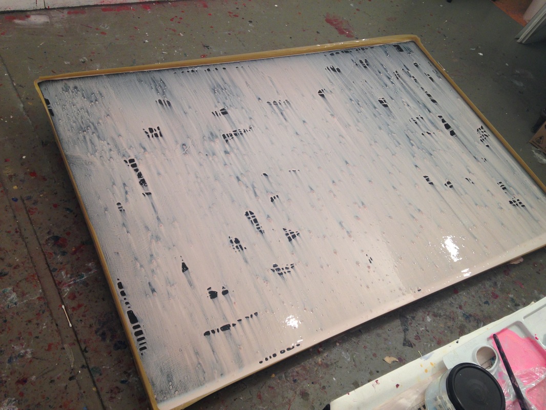
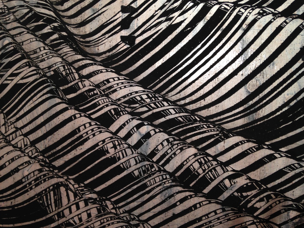
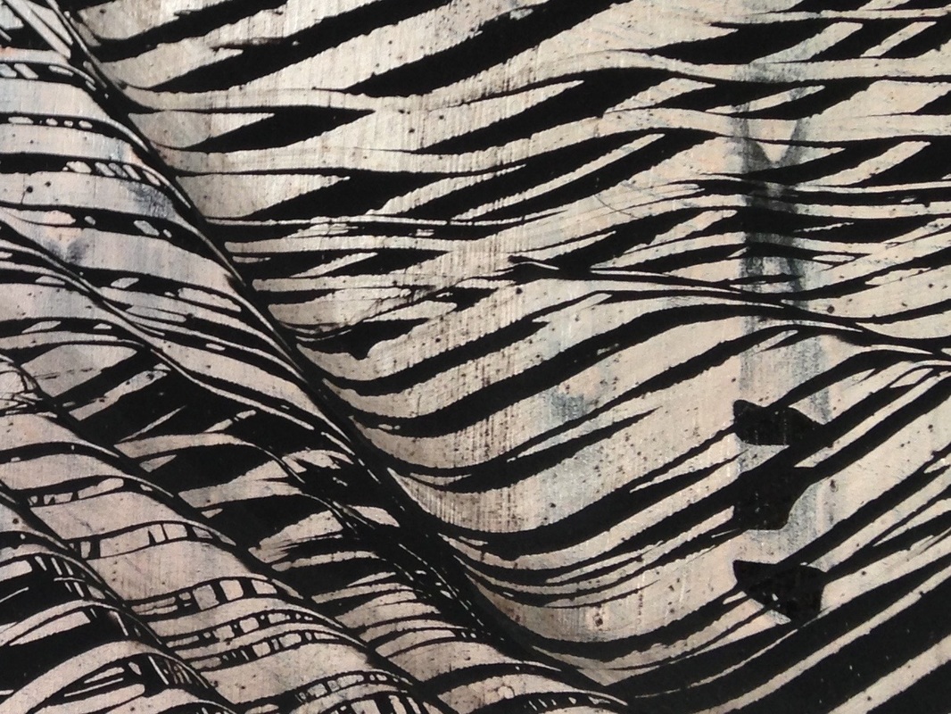
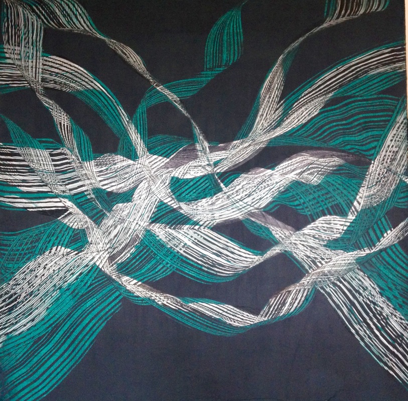
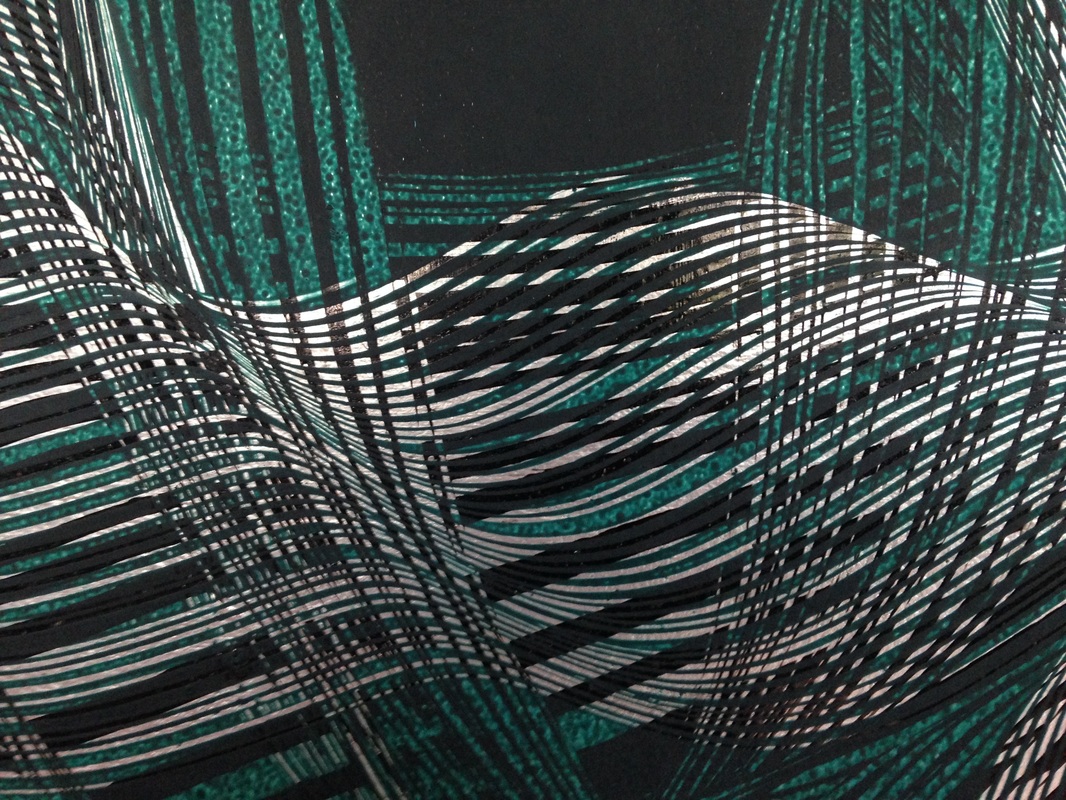
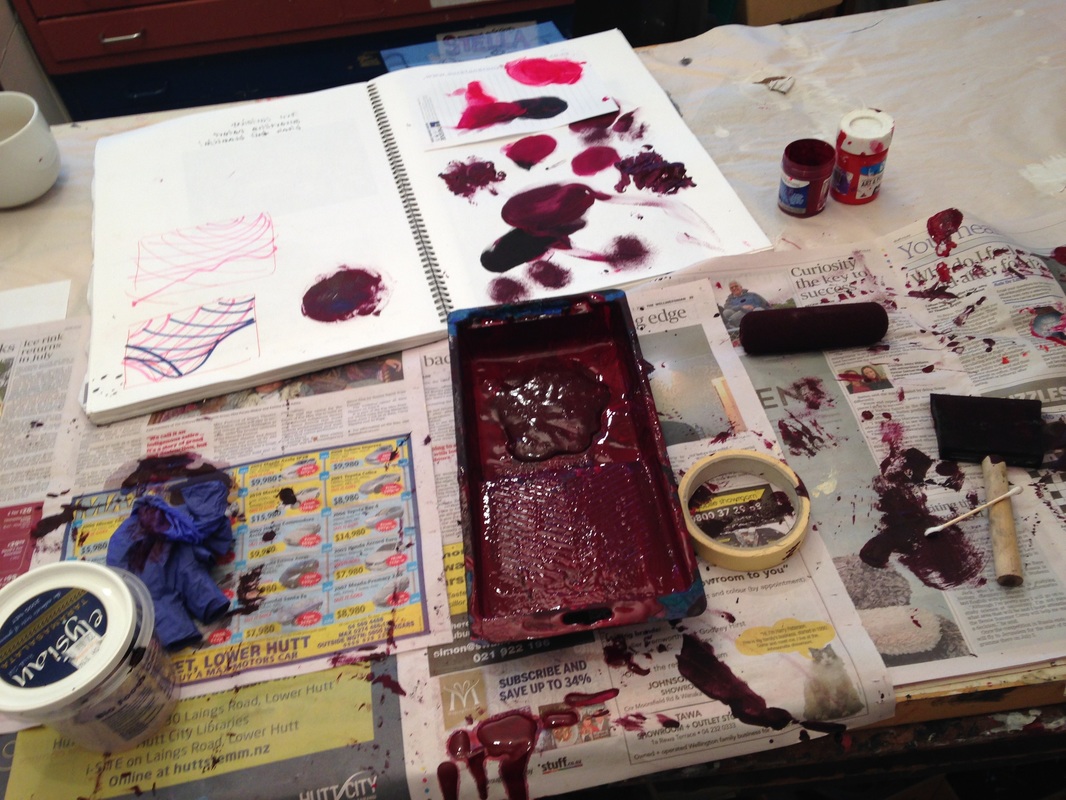
So good to feel like combing some new work, it feels like the never ending unfinished project, like going home. I haven't really allowed myself to work in serveral consecutive bodies of work and it feels like such a freedon - to just do the mood, and switch, from small, intense, colourful. free, works to monochromatic structured work. I love apricot - running throught all this work. 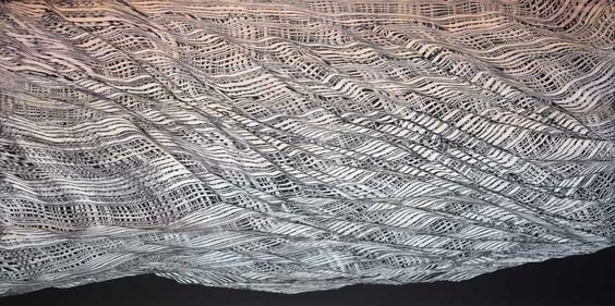 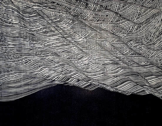 Realy followed my mood for a fresh start...back in the city and a urge for colour, expansiveness, transparent layers, brightness! Hard to resist my combing tools, and still like to 'sweep' . This work is hanging in my home in Lyall Bay and can be viewed there. Untitled (2023) 150 x 150mm, mixed media 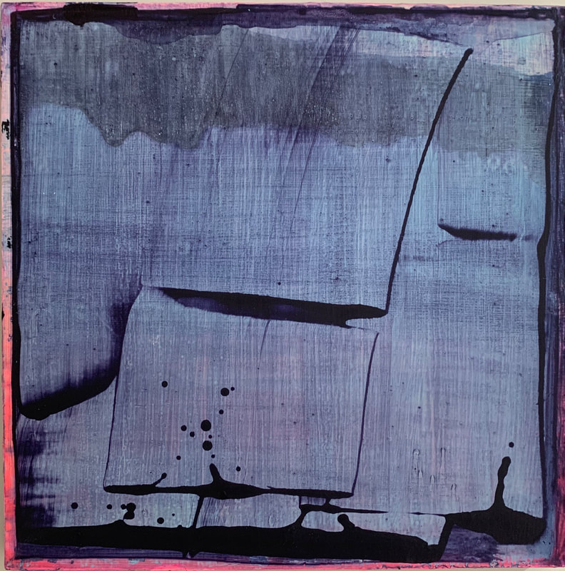 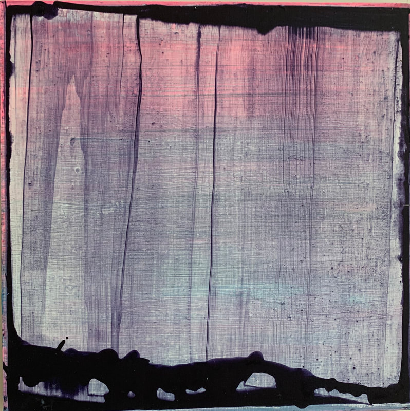 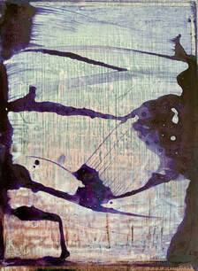 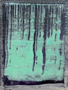 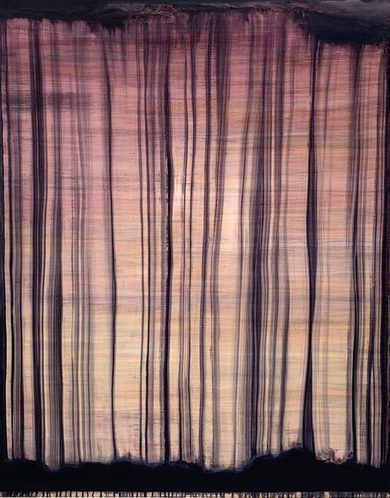 Sweeper (2023) 1500 x 1200mm 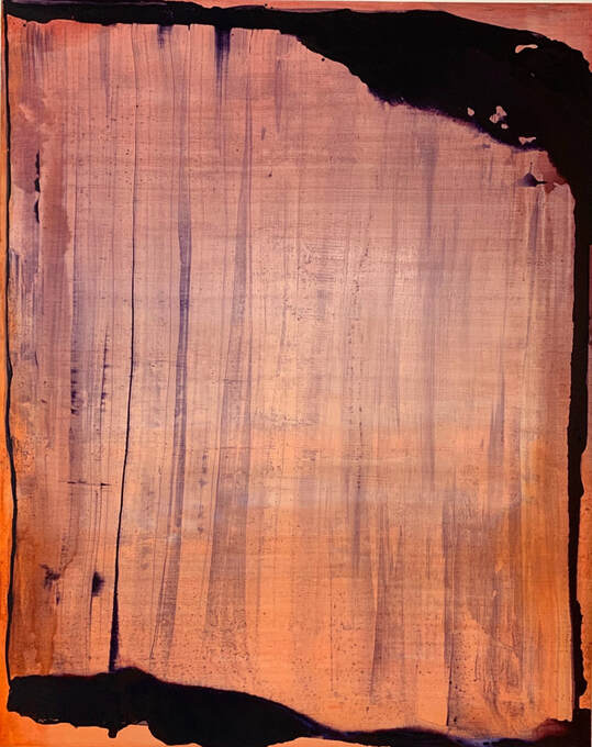 Voila (2023) 1500 x 1200mm 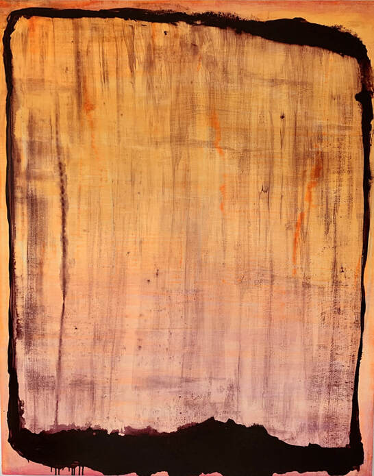 Kizbam (2023) 1500 x 1200mm
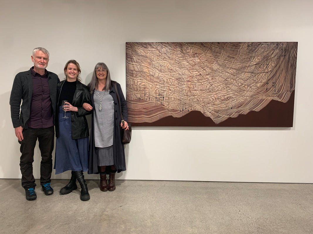
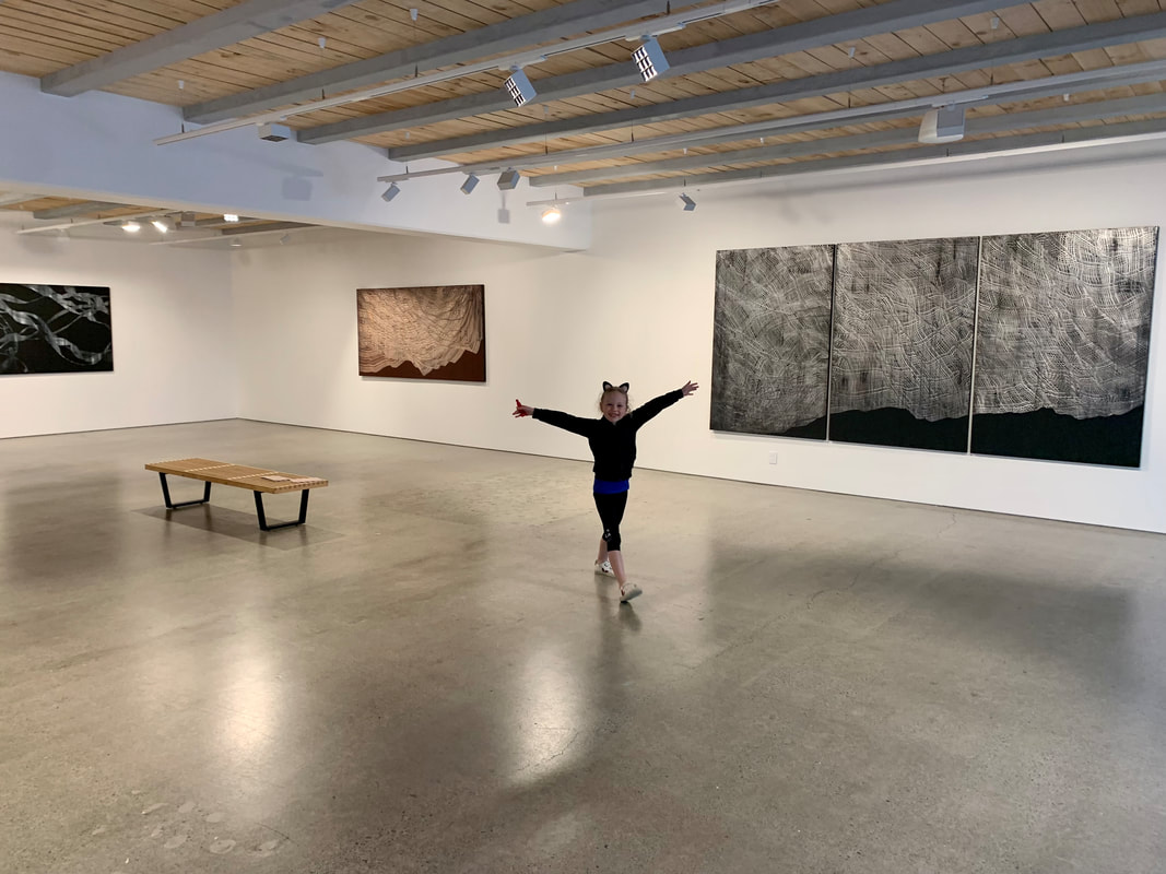
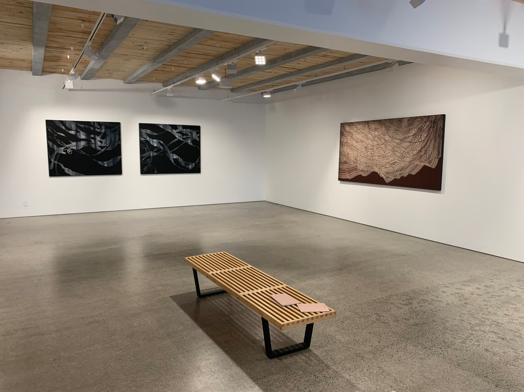
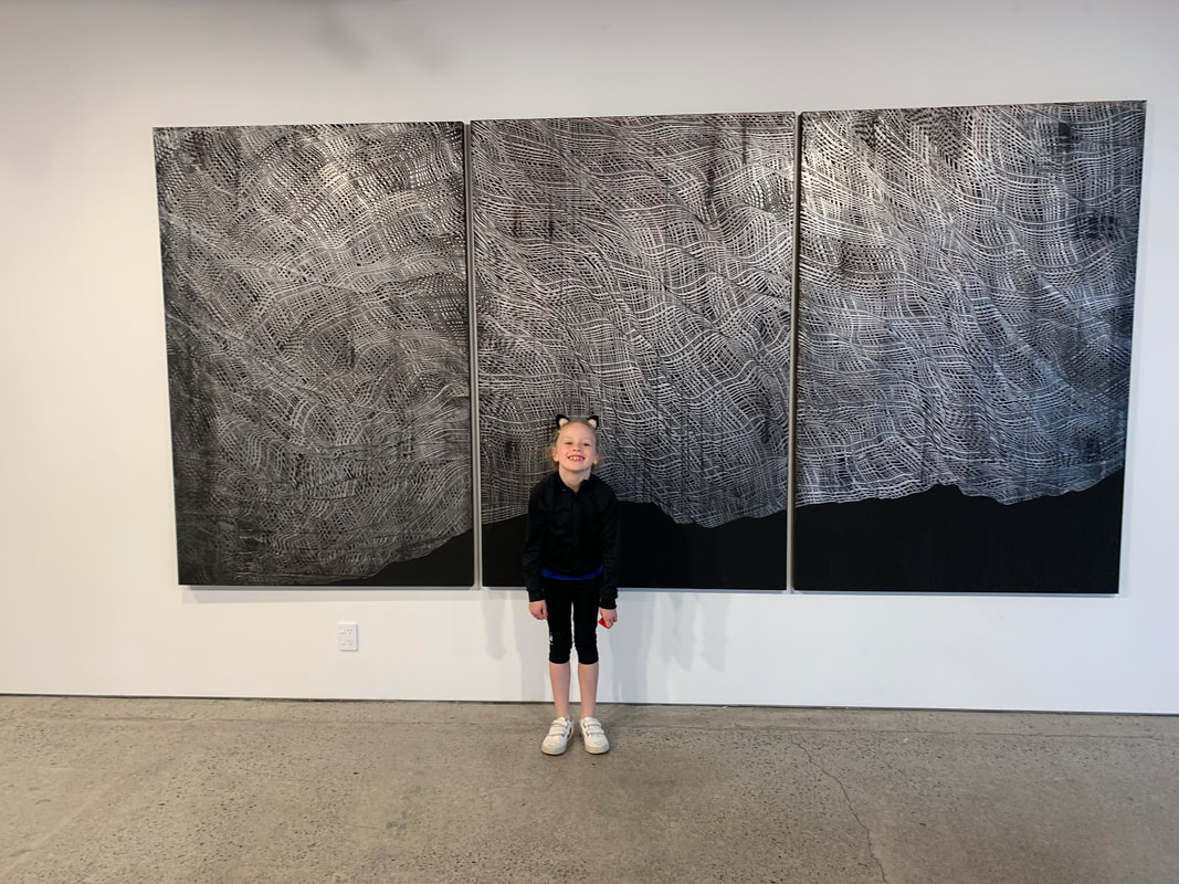
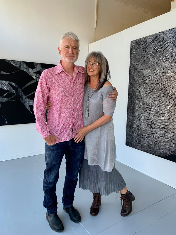
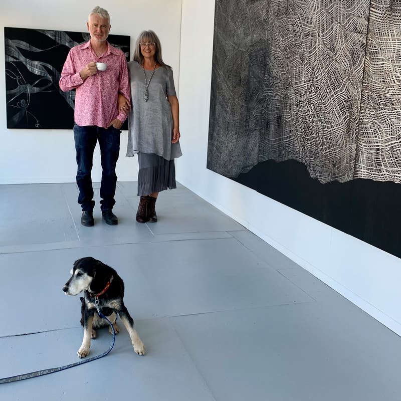
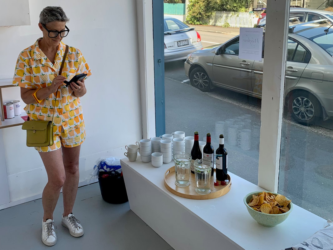
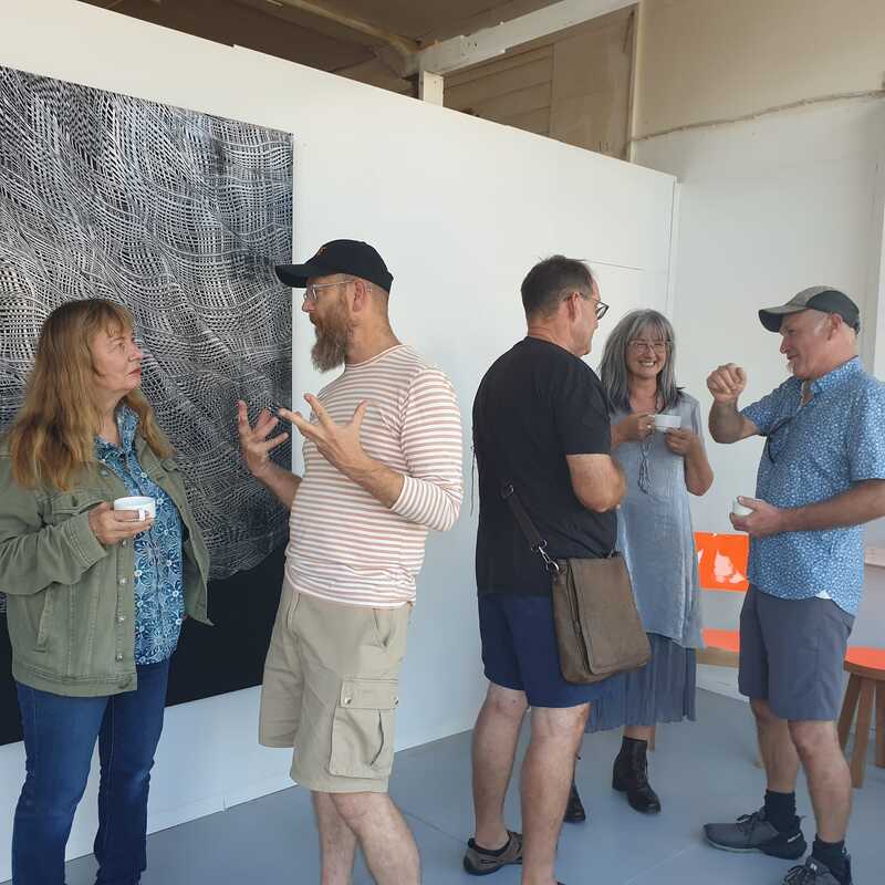
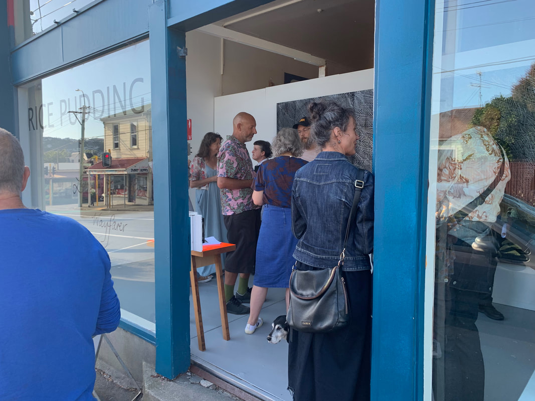
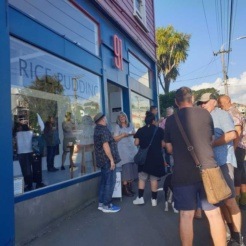
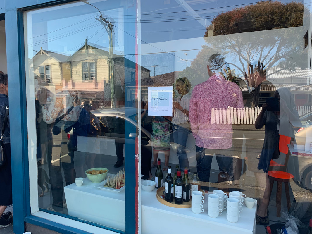
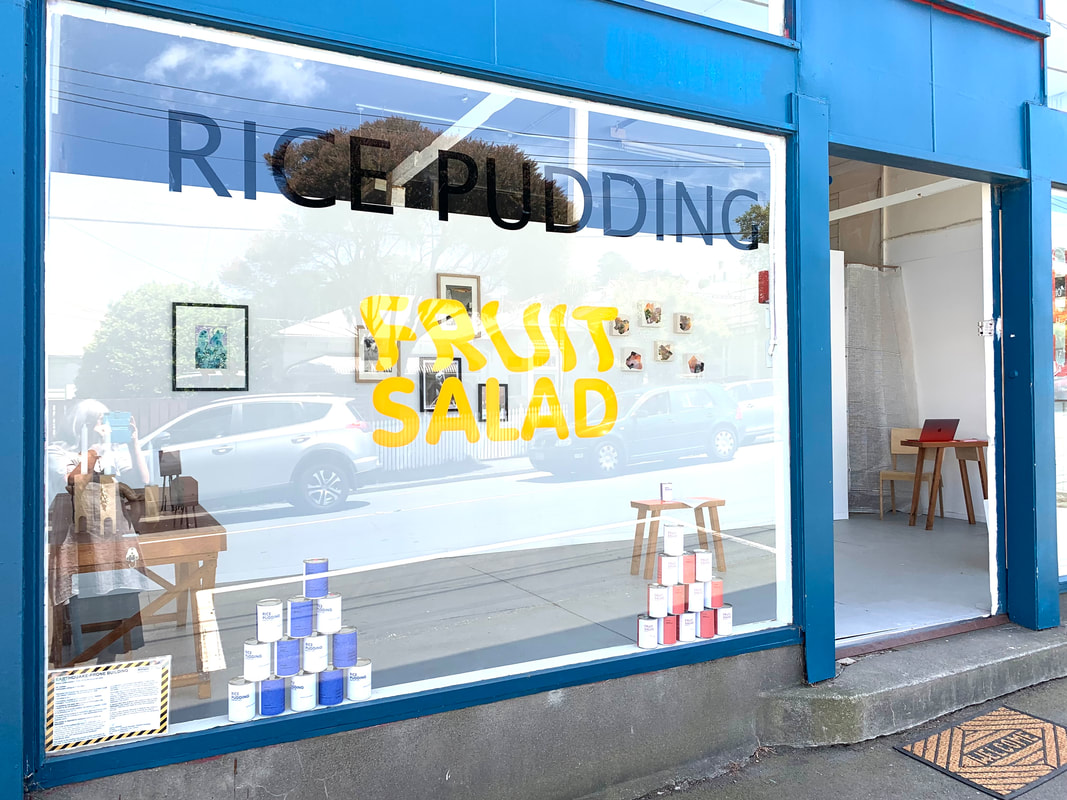
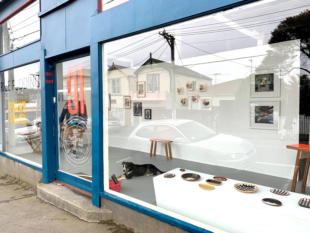
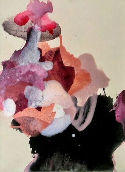
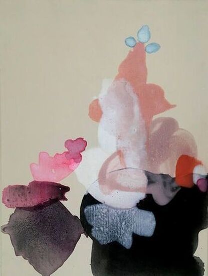
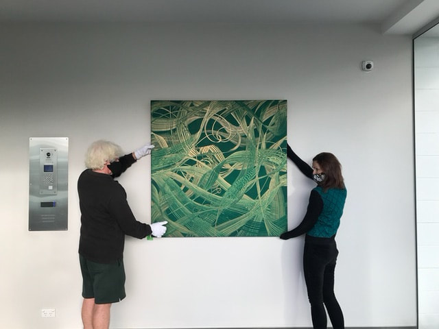
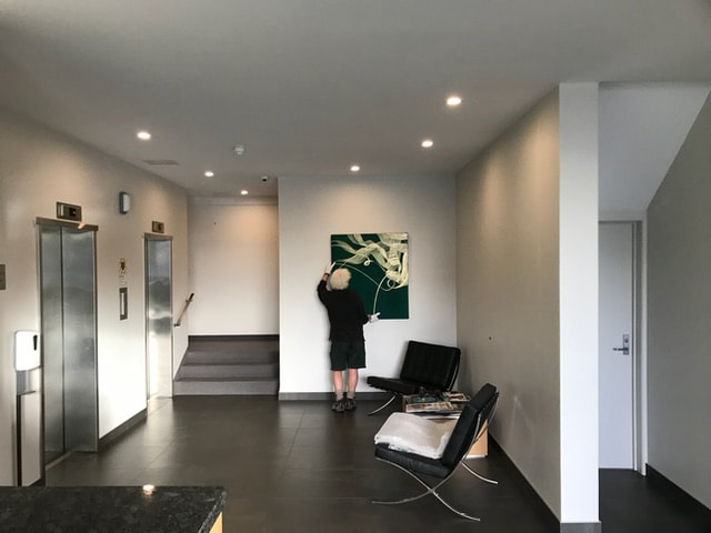
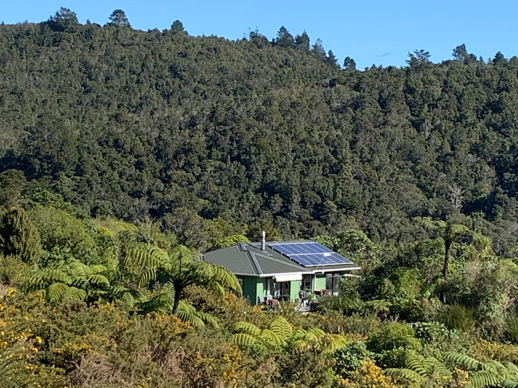
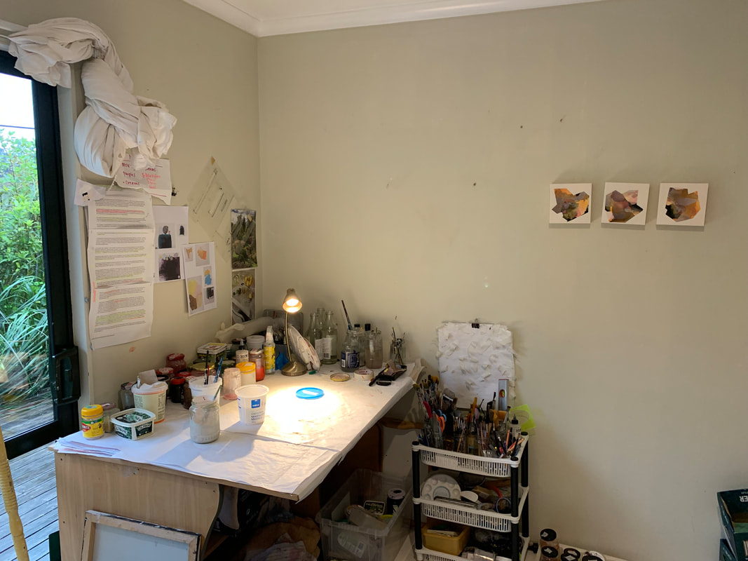
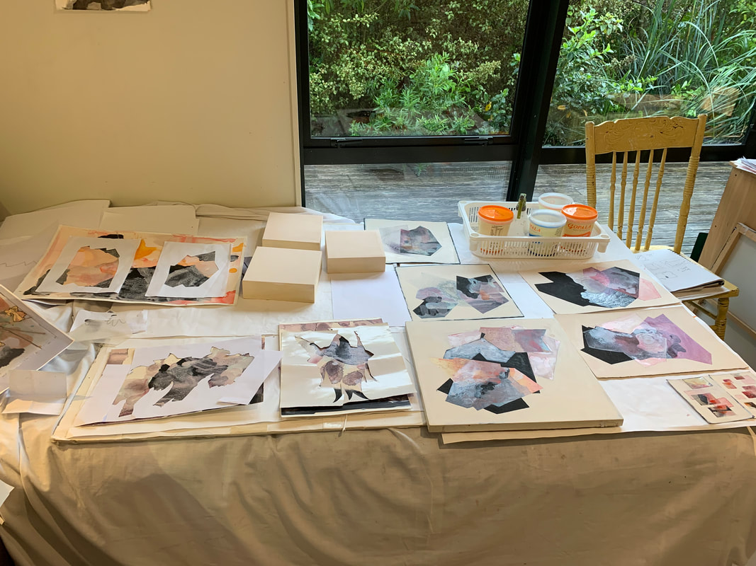
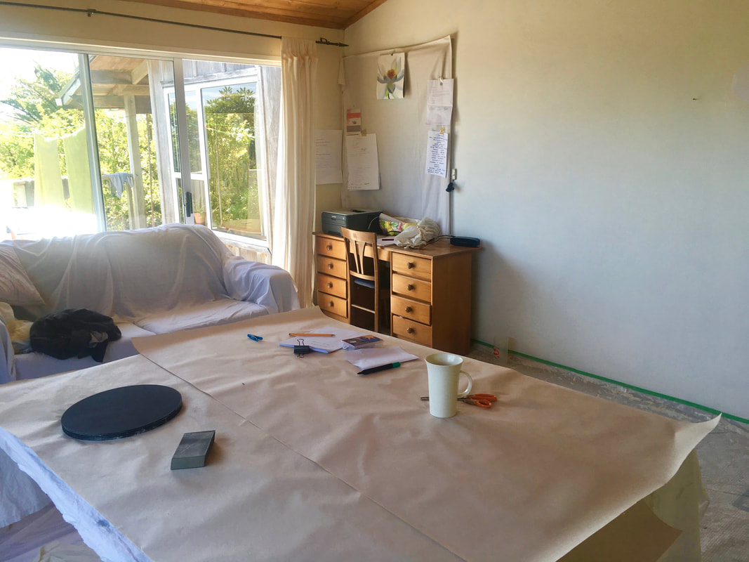
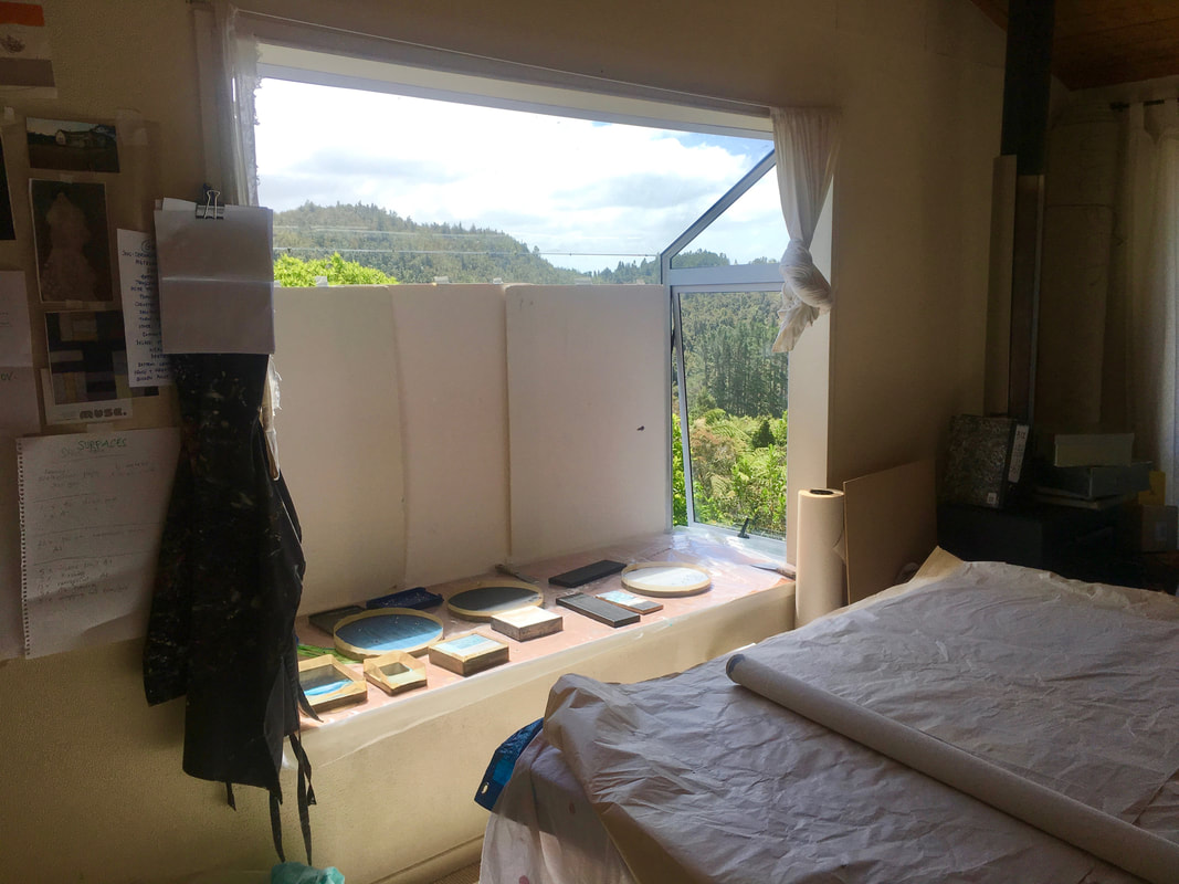
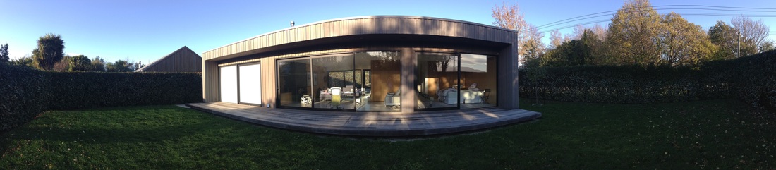
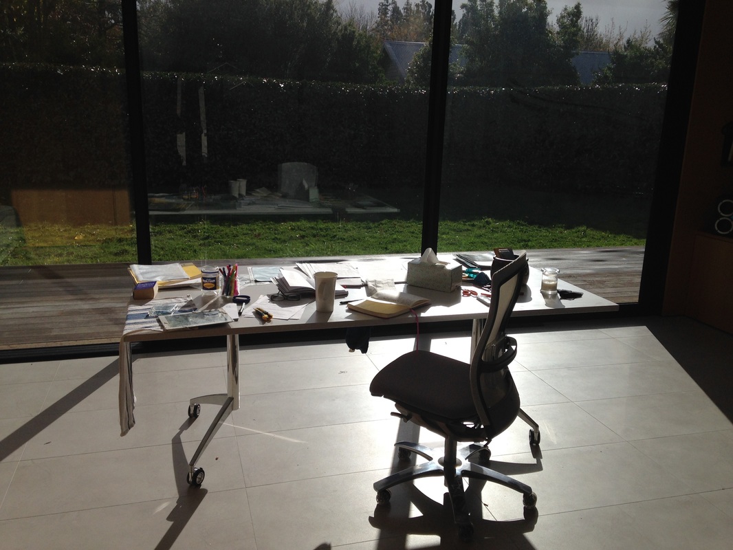
Had a show of my paintings at beautiful Webb's Gallery in Wellington. These works have been well shown now and have gone to some homes. Lovely Florence 'my charge' keeps me inspired. Lovely to have the opportunity to show in Wellington and connect back into an art community here. Here's some snaps from my opening at Rice Pudding Gallery, in fabulous Newtown. These works have been in storage in Gallery vaults and I have just got them returned, like old friends visiting! Ideal to be able to give a new outing time and context. ...and a group show after being back only a few months. I was delighted to be invited to join a group show in a new gallery in town 'Rice Pudding'. 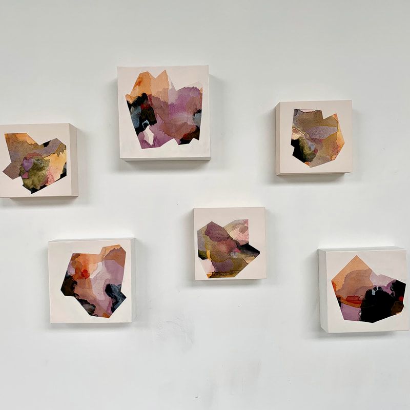 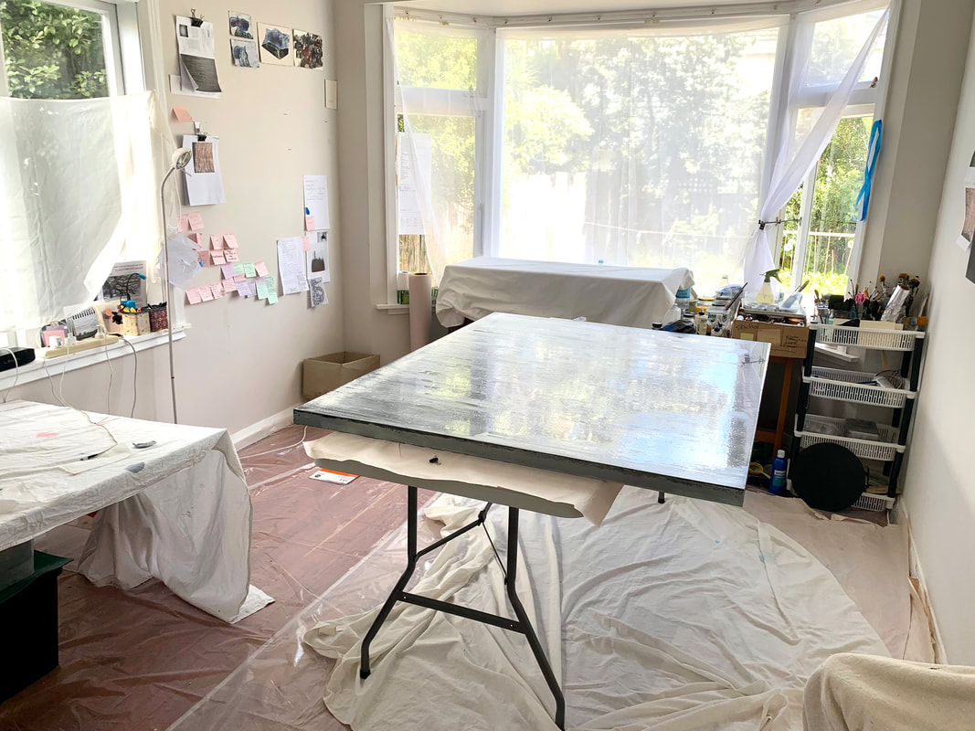 So great to be back home in Lyall Bay in our Californian Bungalow - so lucky and appreciating Wellington, it's compactness and variety, and mains electricity after 5 years off the grid!. The first couple of months was spent working to restore our home and garden while I also slowly set up my studio and thought hard about my practice. I did a really big review of work from 2008 until now and evaluated what I though was my best work. It was an exciting process and I could see so much more that I havern't done that seems like clear directions and potentialities. So it's fully back to being in my studio - my happy place, and a centre to process what's going on.
|